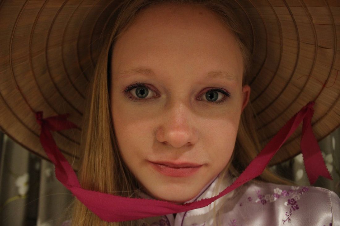
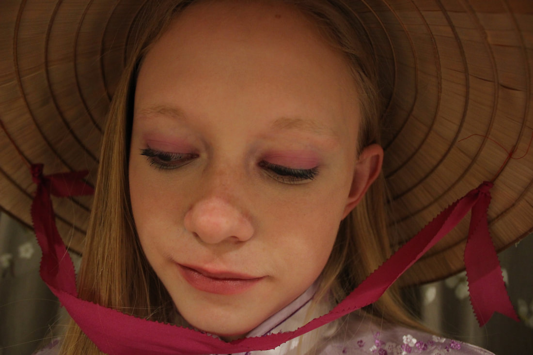
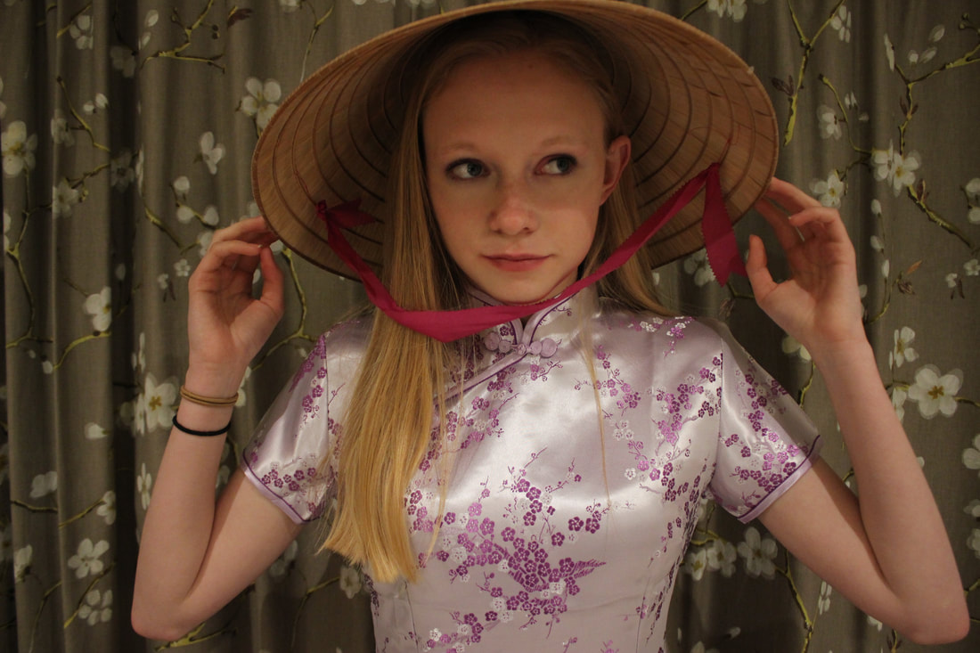
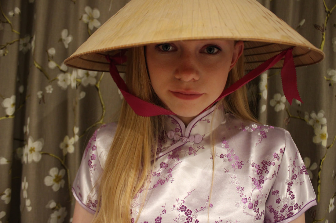
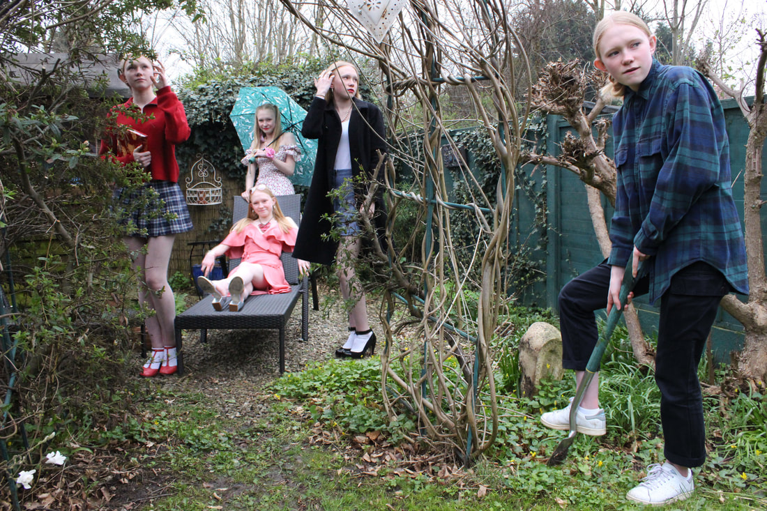
Fragments Pinterest board:
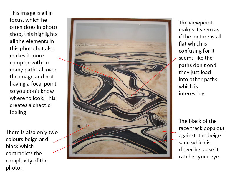
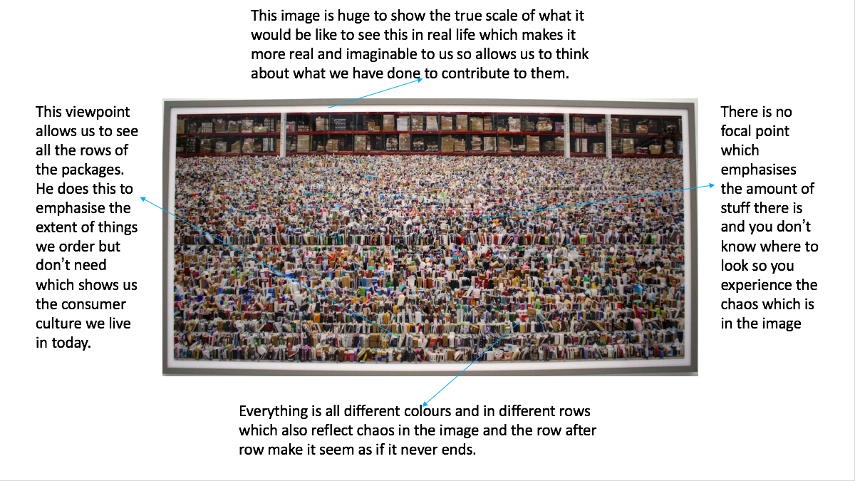
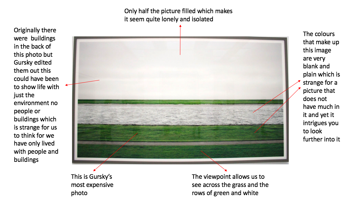
Andreas Gursky
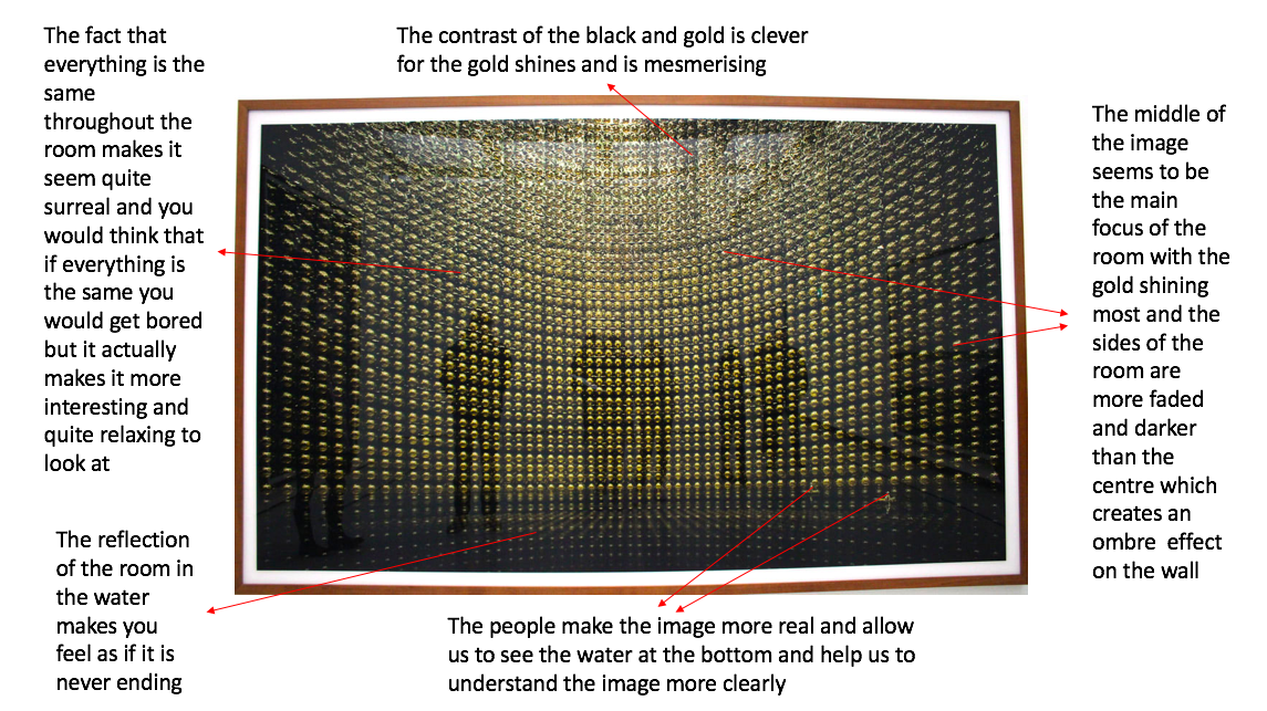
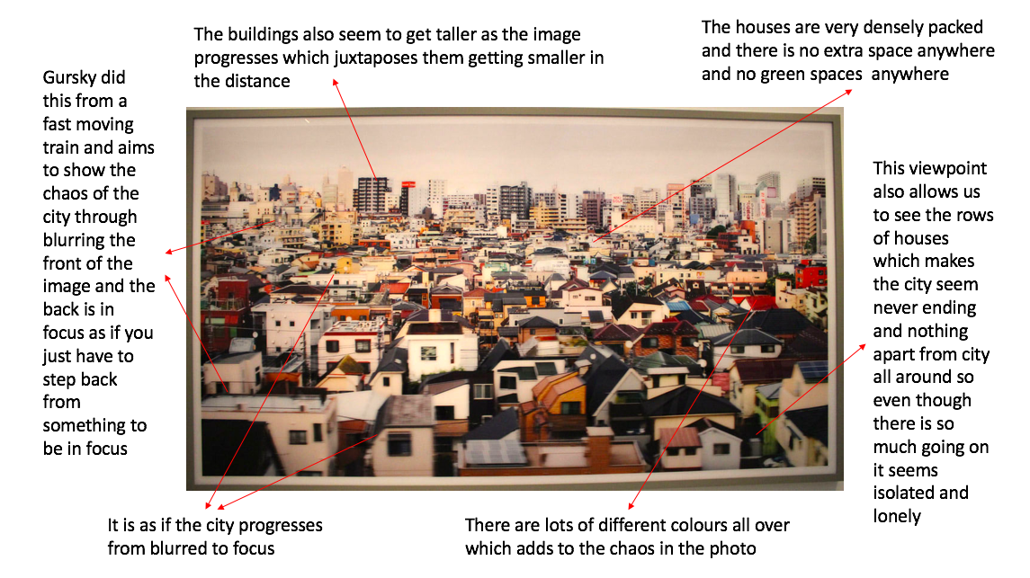
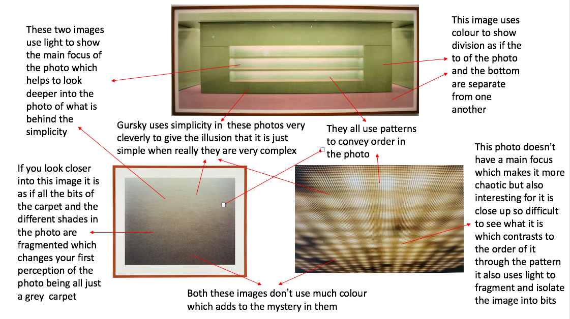
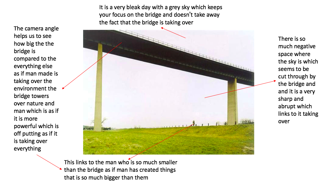
Andreas Gursky is known for his large scale photos often of sites and scenes of the global economy and contemporary life. He also has an interest in 'the way that the world is constituted'. His photographs are not just of places and situations but the nature of image making and the limits of human perception.


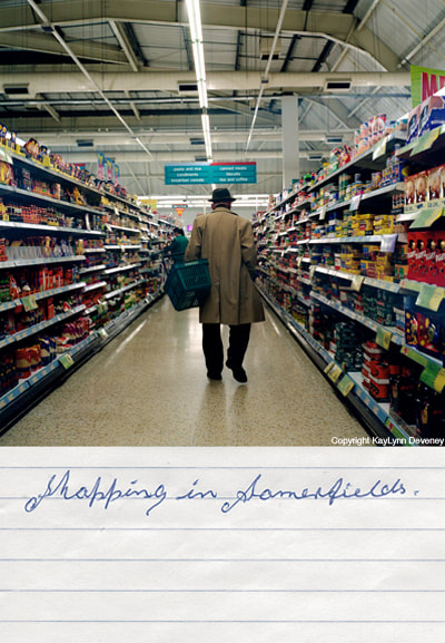
Kaylynn Devney
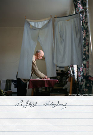
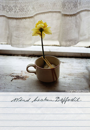
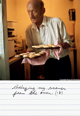
Kaylynn Deveney was born in Albuquerque, New MexicoThe day to day life of Albert Hastings. she came to the uk to to attend graduate school and earned a masters degree in documentary photography at the university of Wales. These photos are from her first photographic book called 'the day in the life of Albert Hastings' where she documented his life with his hobbies what he does day to day and what his interests.
|
|
|
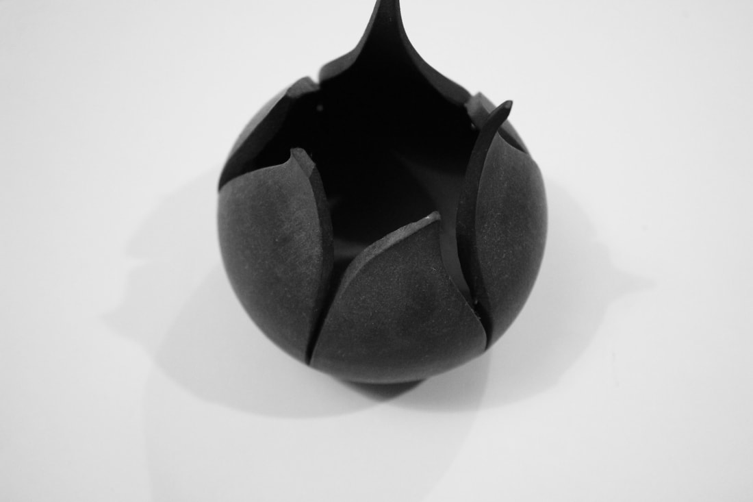
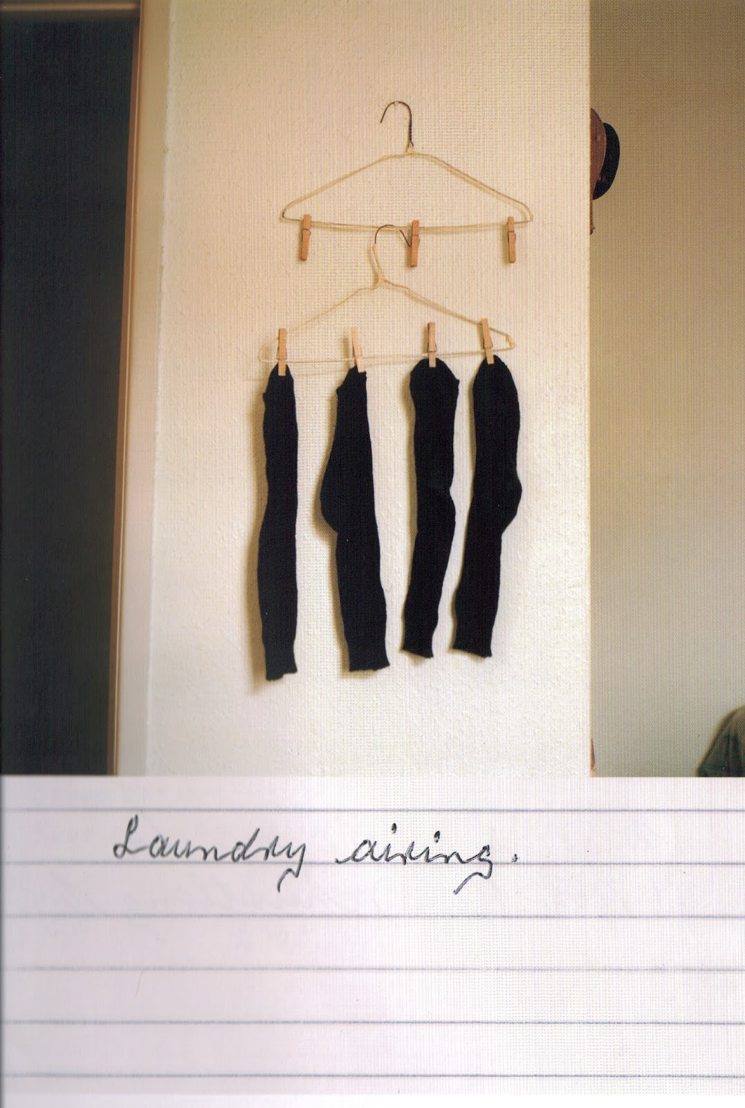
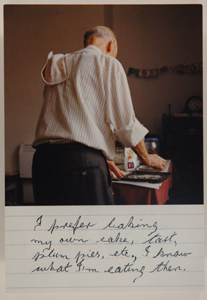
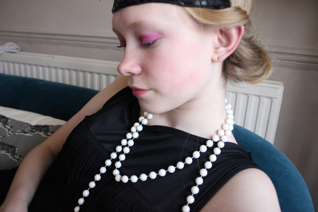
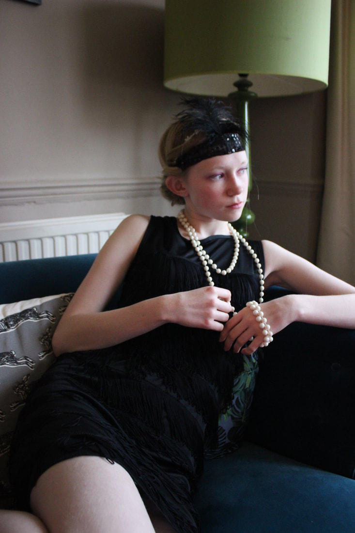
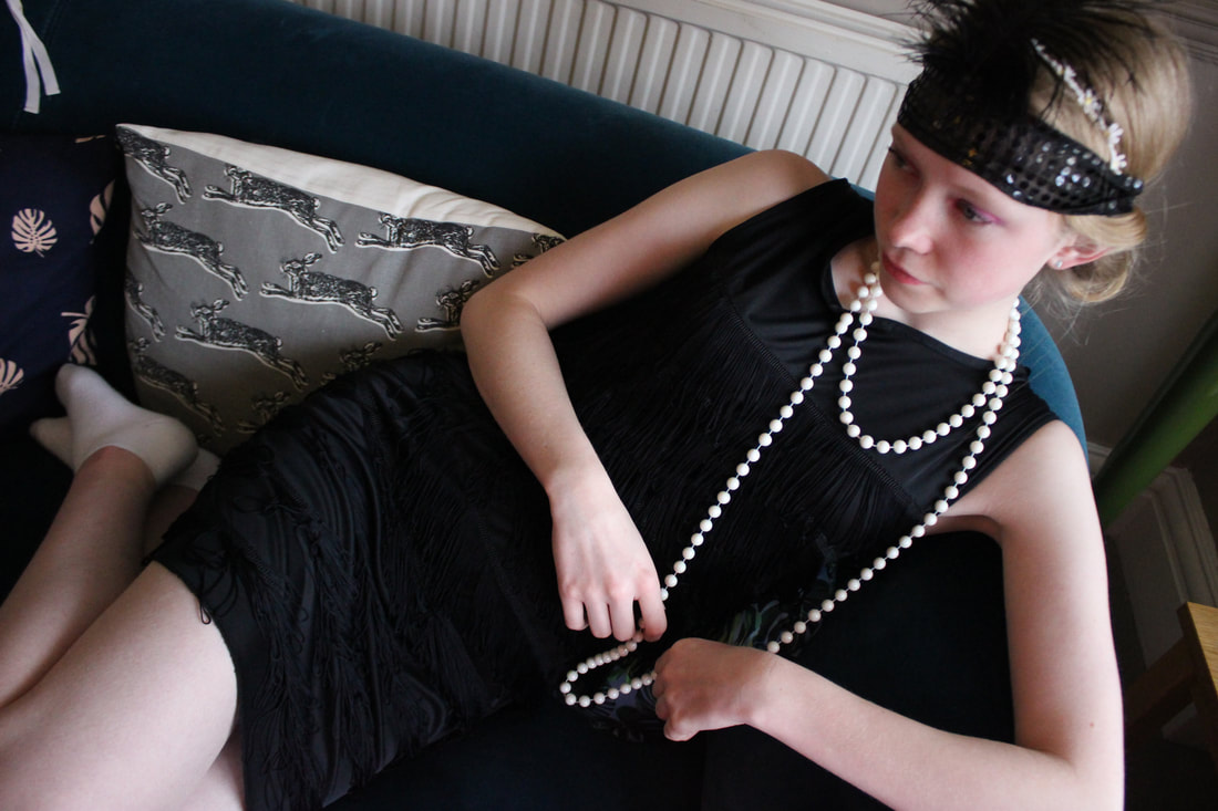
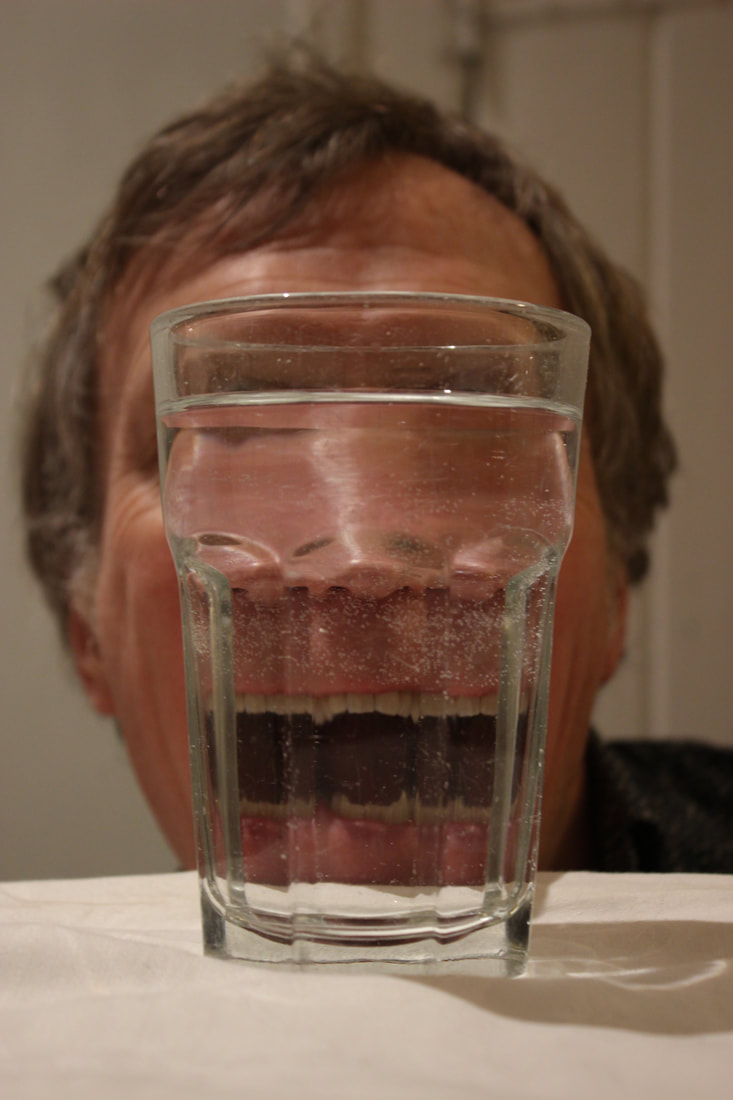
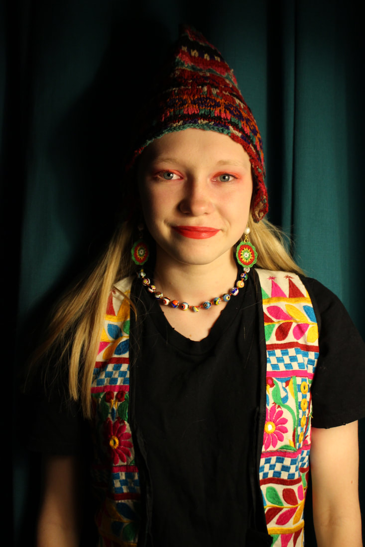
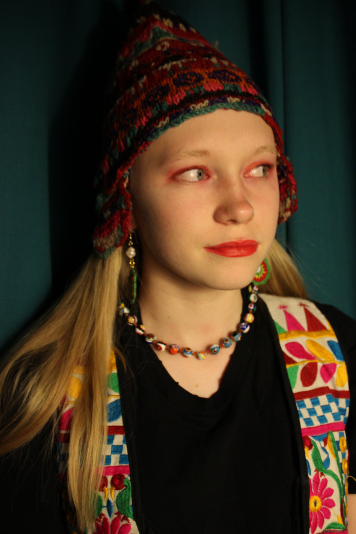
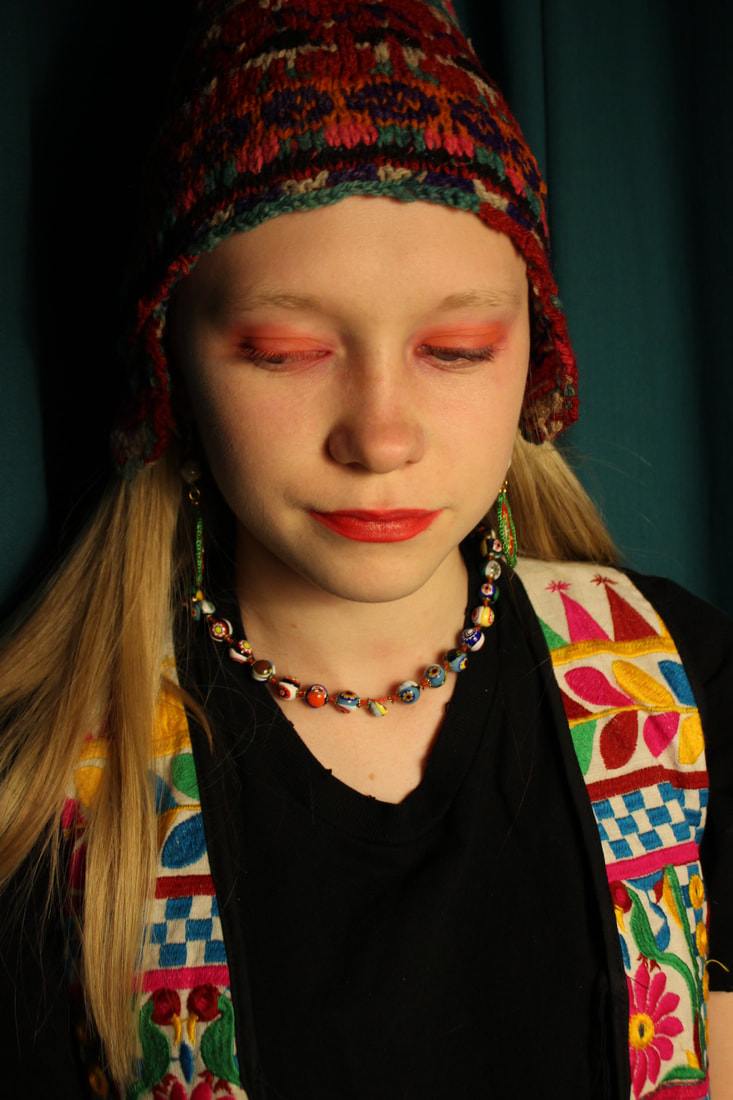
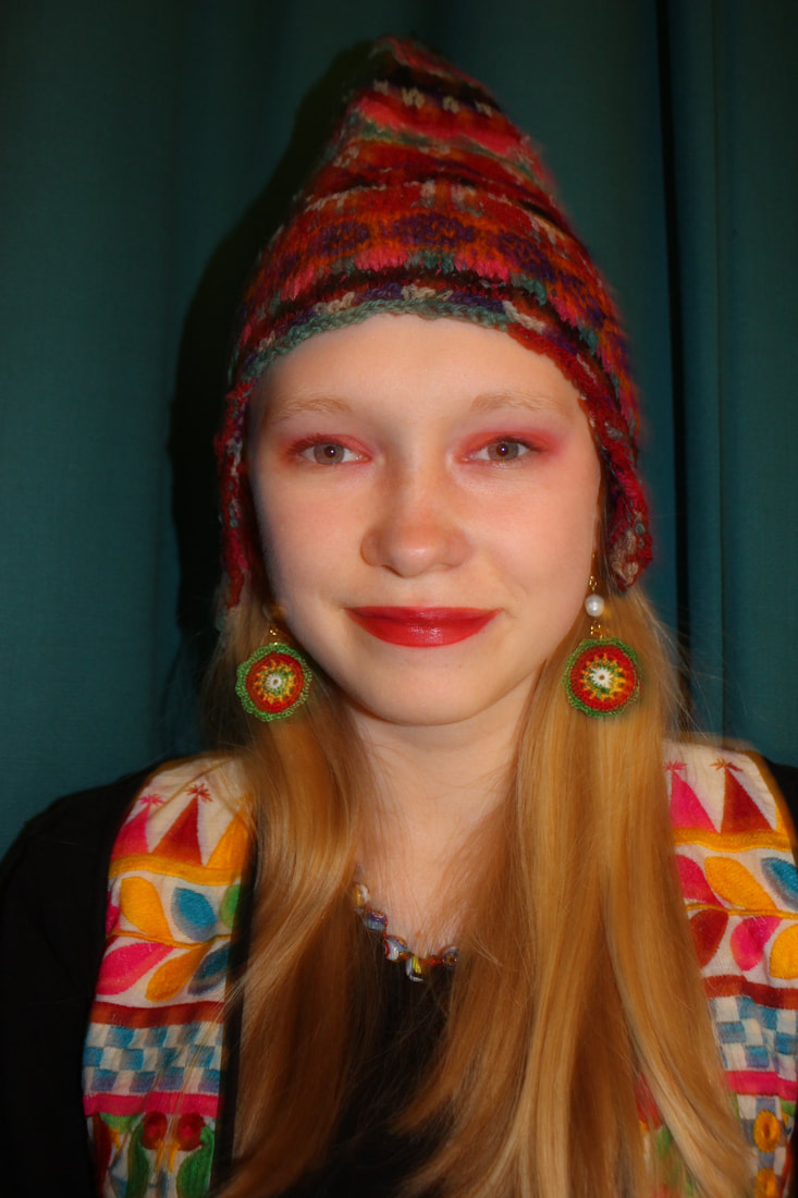
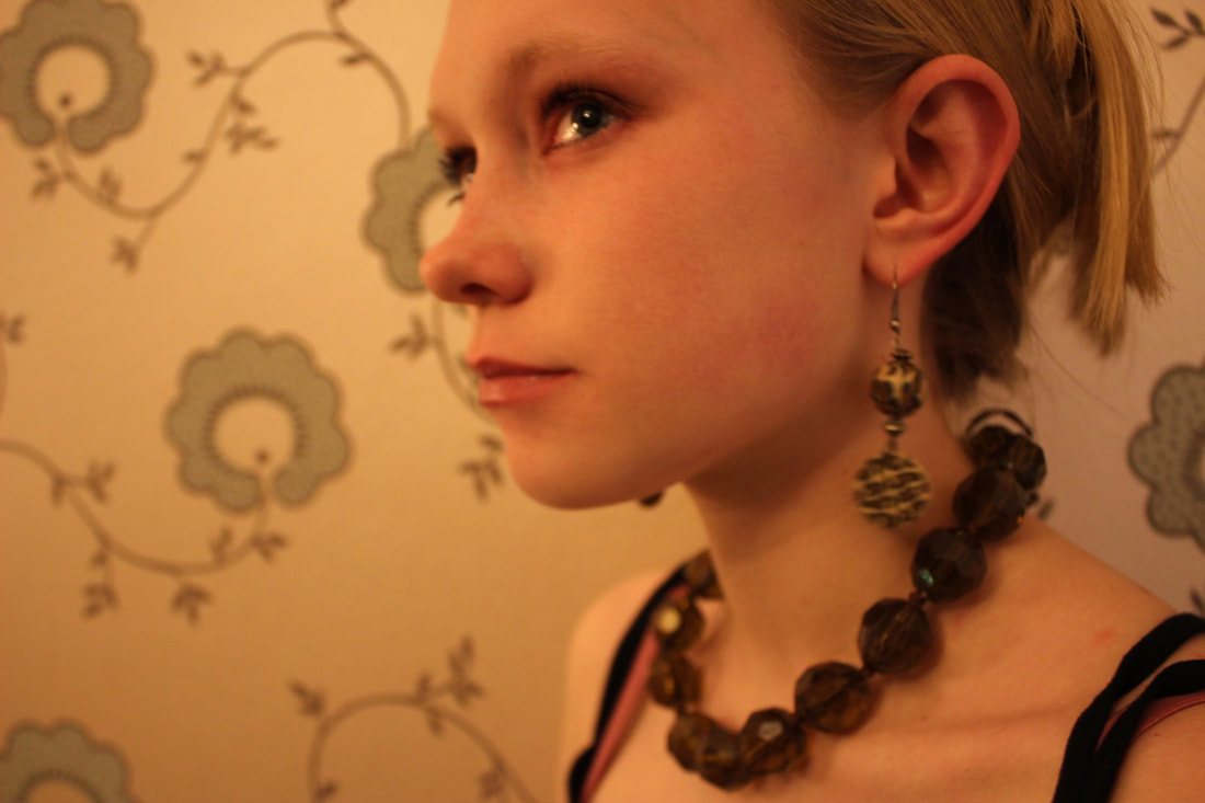
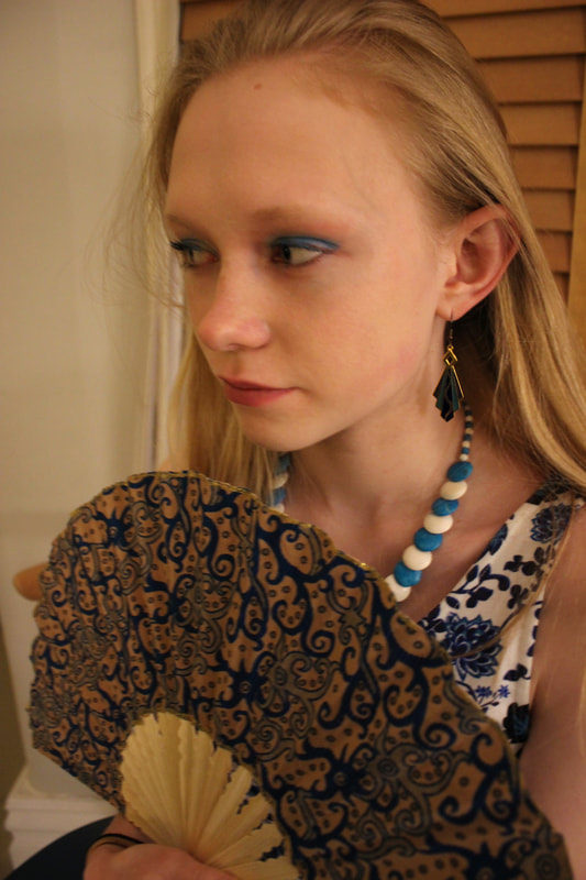
Fragments of a person:
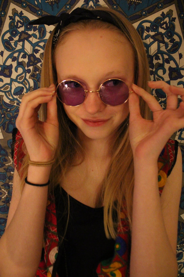
I chose to photograph my grandad because he has things that I think are very particular to him and thought it would be very interesting to photograph those things. He used to work for the BBC as the producer of desert island discs. He loves his garden and works on it almost everyday, he also shaves every single day and him and my Grandma recently had there golden wedding anniversary.
WWW:
I think that this project is very interesting and I picked out everything that reflects him well so for a person that doesn't know him they can almost see into his life. It is also like a diary which makes it like a project which makes it more interesting to look at it as a collection rather than individual images.
EBI:
I could have tried to do some more photos of what he likes to do as well as what he likes, for example him gardening or going food shopping or out for a walk. I also could have thought more carefully about the order of the photos and what would be best to look at.
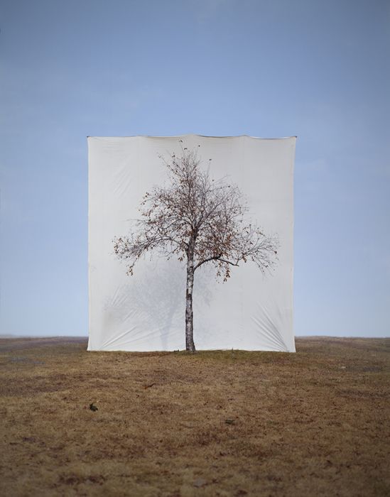
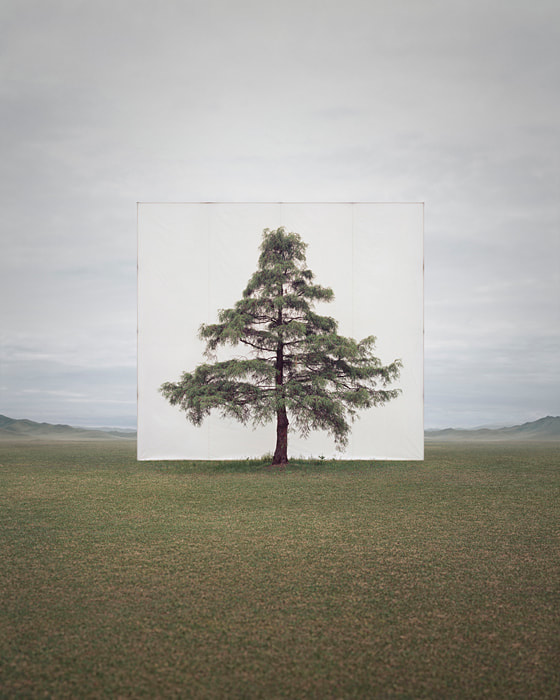
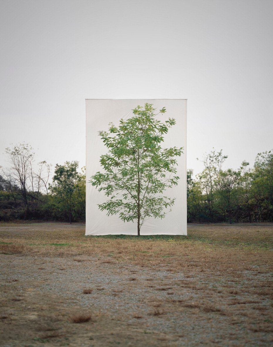
Myoung ho lee
Myoung ho lee is an artist from South Korea who isolates nature from its surrounding using a white background she does this to emphasis the original beauty of the trees. To do this she uses a maximum of 25 by 12 metre backdrop behind the trees dozens of people are involved, two cranes are used and all equipment including the lighting system are brought.
|

|
|
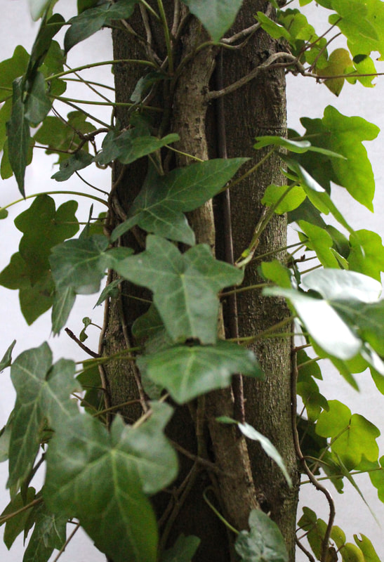
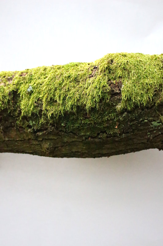
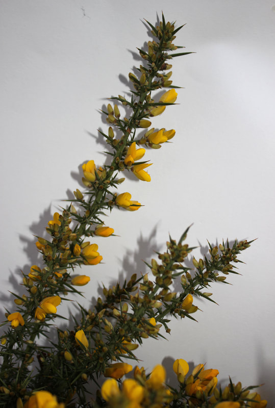
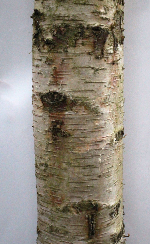
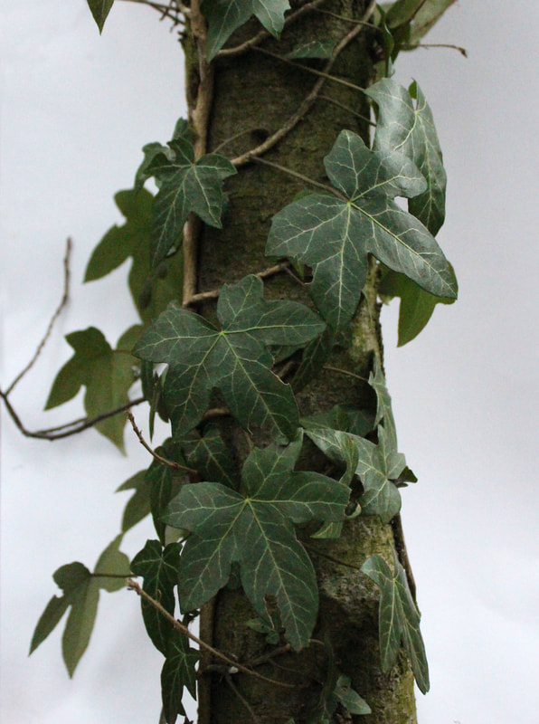
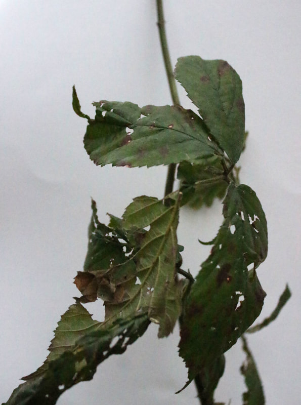
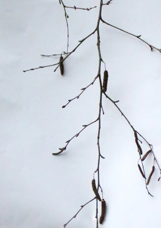
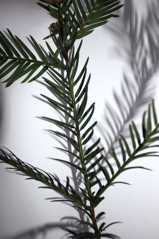
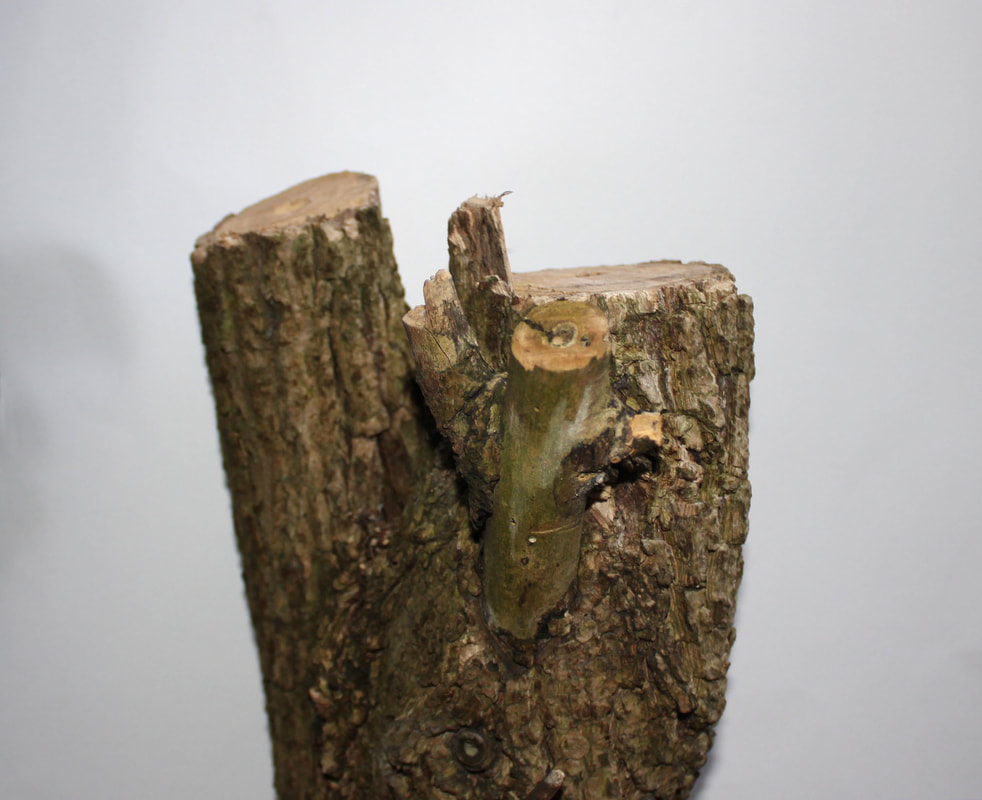
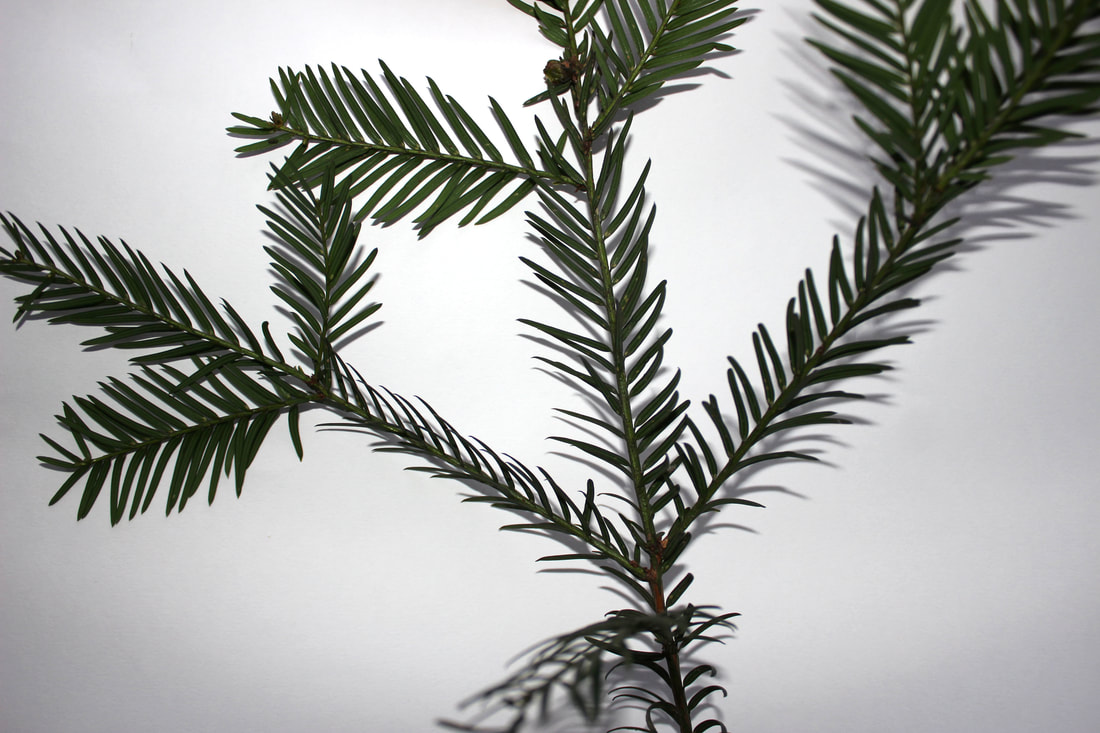
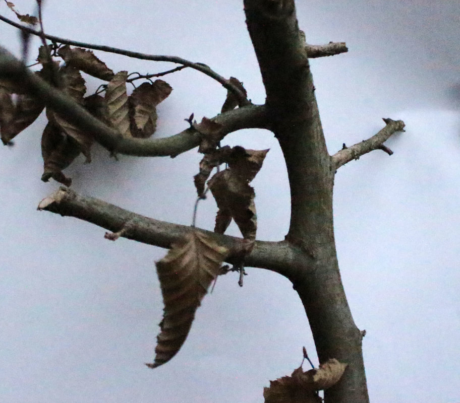
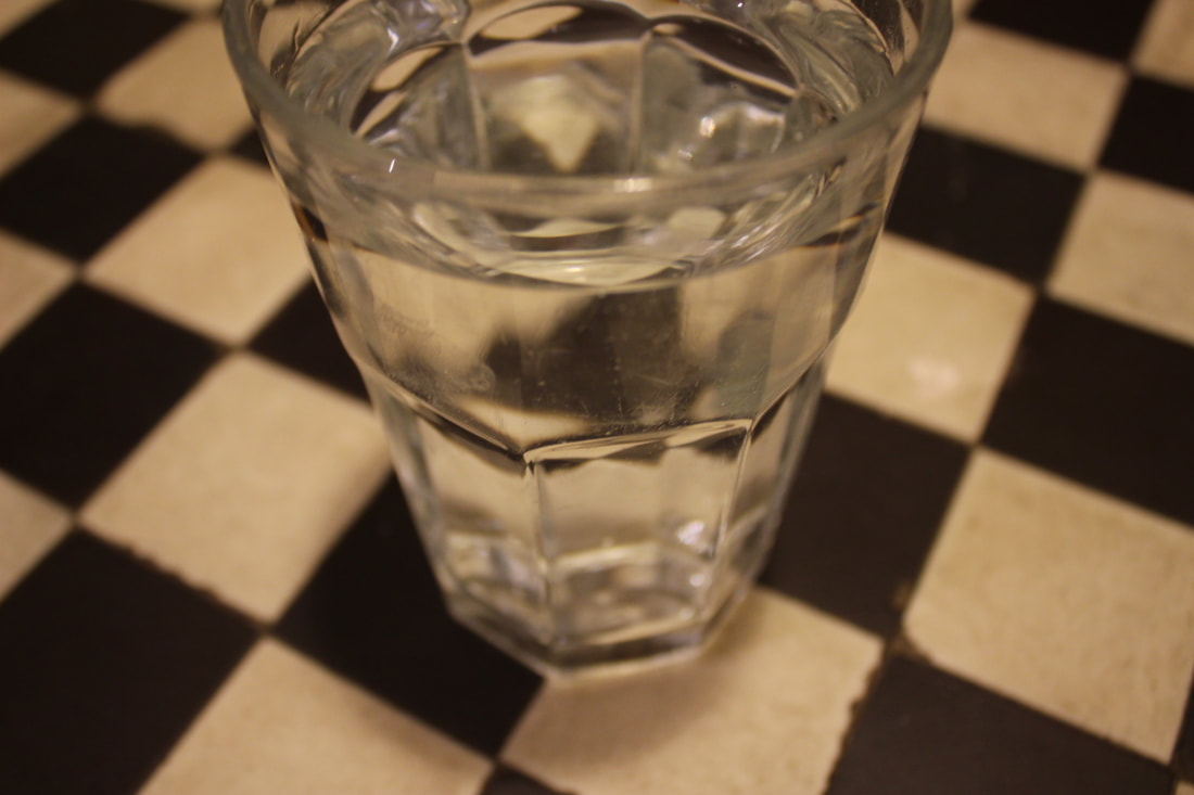
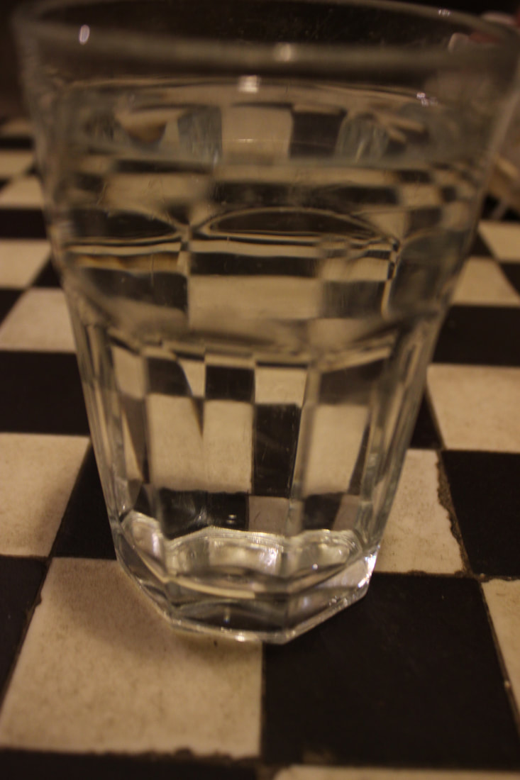
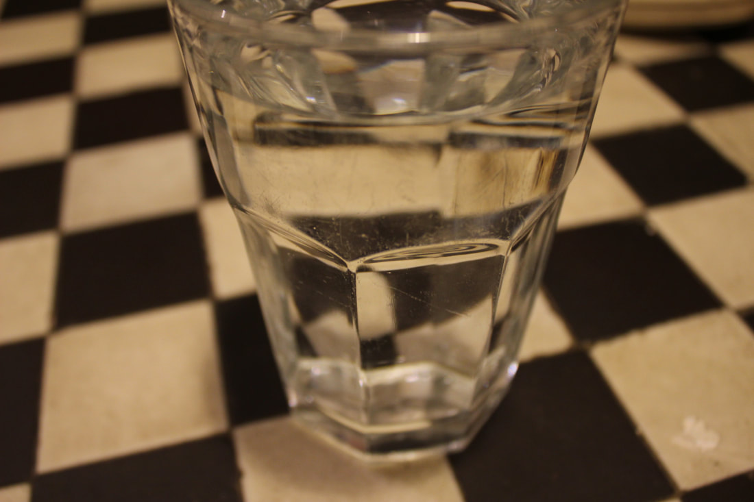
Fragments of Nature:
Here I wanted to do what Myoung Ho Lee did and isolate the environment from its surroundings. I wanted to capture the use of colour to contrast the green of brown of the nature. I also wanted to use interesting parts of nature and the shapes of the nature to make the photos more interesting.
|
|
|
|

|
|
|
|
|
|
|
|
WWW:
I like how I captured the colour in nature in the first three. I also think that the tangled and twisted stems and leaves make the images very interesting. I isolated the nature well so that the nature contrasts to the white of the background well which follows Myoung ho lee's work and allows you to seethe idea of isolated nature very well
EBI:
I could have done some more colour in the last few ones with a few more flowers. I could have also tried to do some more shadows in some of them. I also could have tried to do some further away shots rather than just close up to get more of a variety and see what worked best.
Artist and Me
|

|
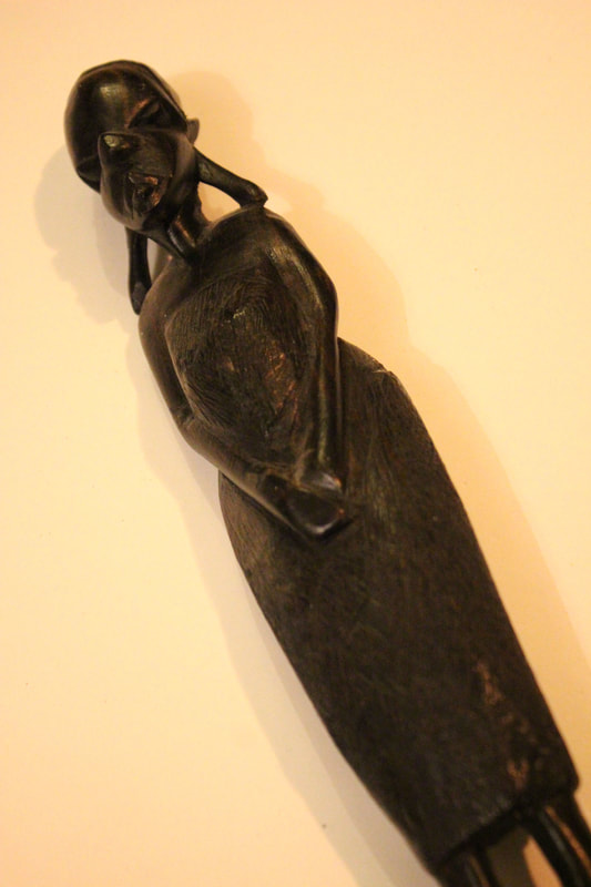
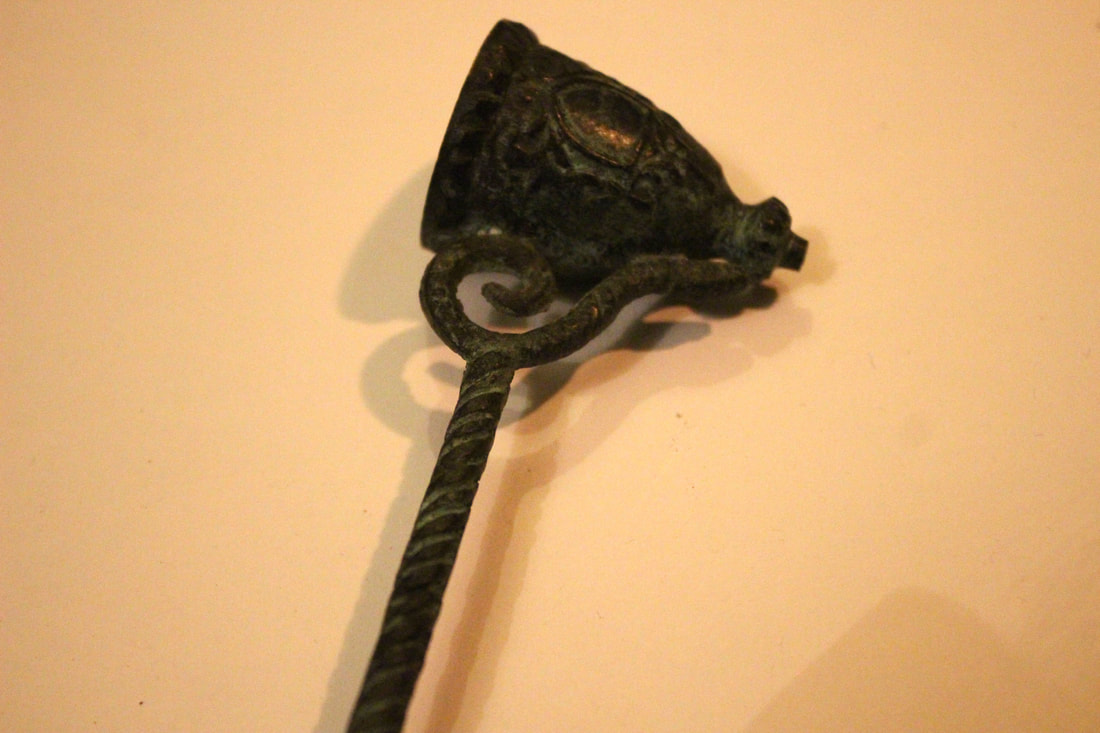
Dan Tobin Smith
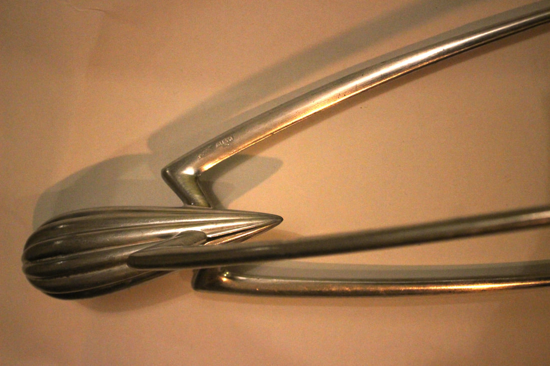
This project is called the skin issue where Dan Tobin Smith puts a man made object infront of a white background and takes a picture of it. This isolates the object and clearly shows the different angles on the object. I really like this work because the objects are very rigid with sharp edges which seem far away from the background which makes them seem very isolated. They are also very close up which helps to intrigue us by wondering what they are. These images are also very simple however they are very interesting which is difficult to get out of a picture.

|

|

|

|

|
Fragments of Man-Made:
In these images, I wanted to try and contrast these images to the nature images and isolate the images from their surroundings but also contrast them to the white of the background. I also think that the closer up they are the more interesting they are for you wander what the object is.
1ST RESPONSE:
|
|
|
2ND RESPONSE:
WWW:
My second response better follows Dan Tobin Smith's images for they are closer up. This makes them more interesting for you wander what they are, but also creates more interesting shapes. The background is also whiter than my first response which looks much better as it seems cleaner and makes the edges of the objects more sharp to look at. The angles of the objects are also interesting to explore which looks the best.
EBI:
My first response photos are quite yellow so it is hard to compare them with the nature images so I could have tried to photoshopped them or make them black and white so better contrast with the objects against the background. I could have also used a more variety of objects and tried to follow Dan Tobin Smith by using rigid objects to contrast more with the white background.
Man-made developments:
PRINT SCREEN PROCESS:
|
|
|
|

|
|
|
WWW:
These are a big development from my first response as they are black and white which brings out the object better from the background. It also follows Dan Tobin Smith's work better because black and white makes the objects look more rigid.
EBI:
The objects still don't pop out much because the background isn't completely white so I could have tried to whiten the background a bit more to make the black of the objects contrast a lot with the background.
Artist and Me

|

|
Sun Ji
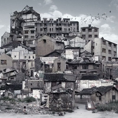
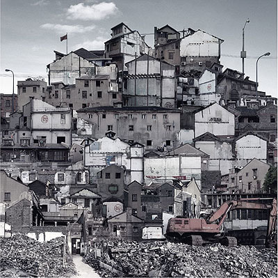
Sun Ji is an artist who was born in Shanghai. In his building collages he draws on past and present of buildings.In his memory city 1 series he juxtaposes black and white photographs of factories and industrial errata. He densely packs all the images together and uses different perspectives which contrasts all the different buildings in the photo.
|

|
|
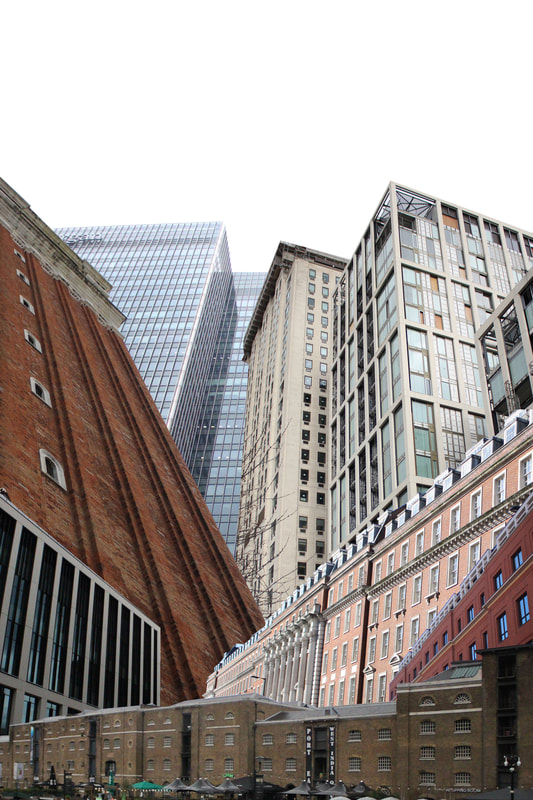
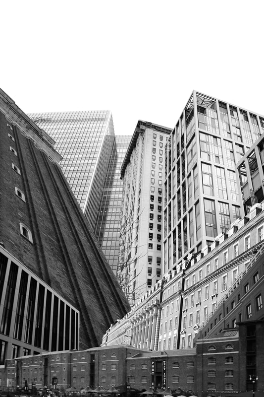
Fragments of buildings:
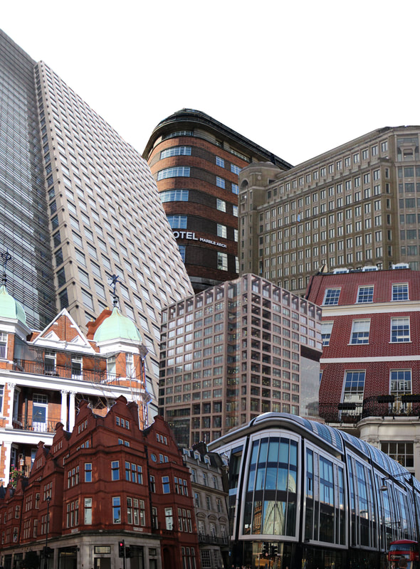
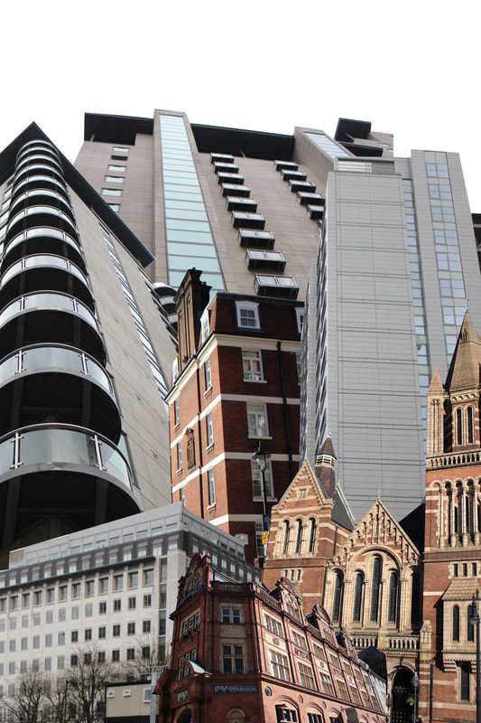
In these images I wanted to show the density of the buildings and the different perspectives.I also wanted to show the different styles of buildings and colours to contrast the buildings which are so close together but so different. I also wanted to put the buildings at different angles like Sun Ji did in his work for it makes it seem more like a collage but also more realistic and interesting to interpret and look at for there is more to take in.
PRINT SCREEN PROCESS:
WWW:
The buildings are arranged well to show the density of the buildings but not too close together so that you can see each building well. I also went to different parts of London so got pictures of different types of buildings to put together so that they contrast each other which makes the images more interesting to look at from far away and up close. This also gives lots of fragments of London which fits into the theme well. The different perspectives of the buildings also work well again contrasting the buildings from one another but also making them more interesting to look at.
EBI:
I also could have tried to put a background behind the photos like the sky like in Sun Ji's photos which would have made the images more realistic than just collages. I also could have seen what the images looked like in black and white and whether it would be effective or not. The buildings are also different brightnesses which makes them a bit more unrealistic so I could have edited them before putting them together.
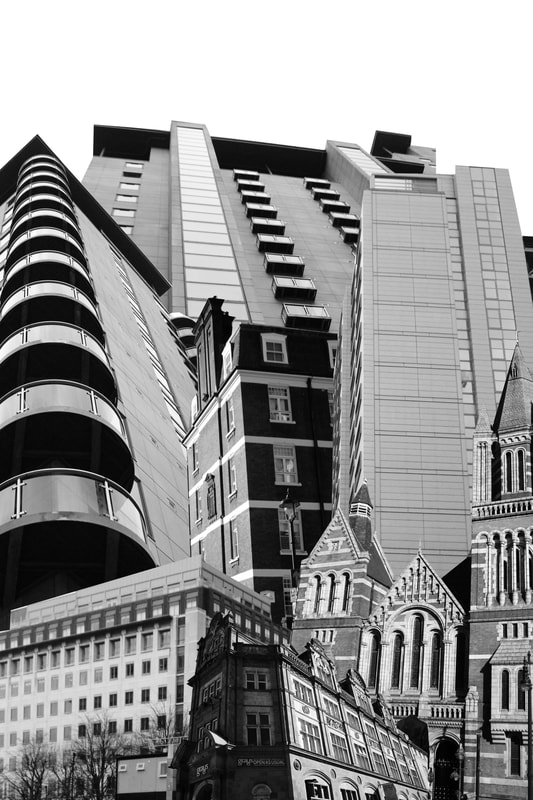
Black and White Edits:
RESPONSE TO EBI:

|
|
|
WWW:
This works to develop my ebi's as it helps to see what these look like black and white and to give me an idea of what I prefer. It also helps to make the brightness of the buildings all the same making the images more realistic. This follows Sun Ji's work better than my last response to focus clearly on the architecture and age of the buildings rather than the colours.
EBI:
The contrasting colours in my last response works better to contrast the buildings whereas here they all blend into each other making the images less interesting.
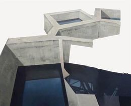
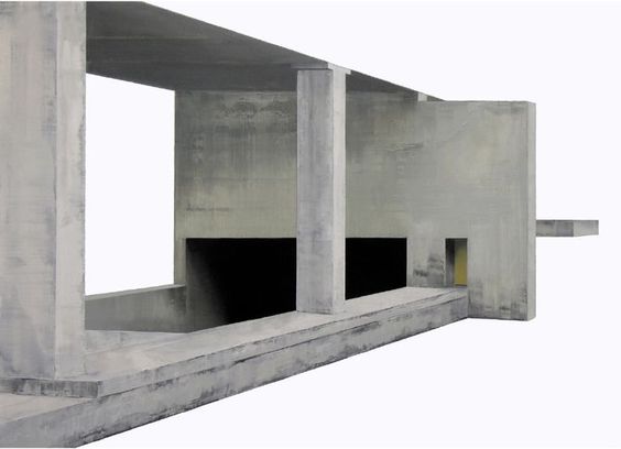
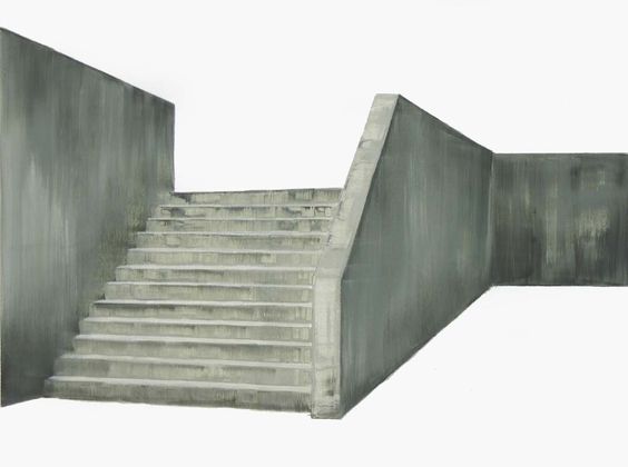
Patrick Cornillet
Patrick Cornillet is a french artist who was born in 1968. In these images he photographs non-space, fragments of an enigmatic architecture that has been left in suspense. These images are very interesting as the buildings are all white and very interesting shapes which works very well with them being cut out. The fact that they are I isolated from their background helps us to concentrate on the shapes of the building without the distraction of the background.
|
|
|
Erased backgrounds:
In these images I erased the context of the photo leaving just the building. This fragments the buildings from their original location exposing it from everything else behind and allows us to clearly see these buildings without everything else that is usually around them. In this, I wanted to isolate the building with a white background using interesting buildings to fill the image and make it interesting even though the rest of the image was blank.
PRINT SCREEN PROCESS:


|

|

WWW:
I isolated the image well on photoshop and the white background is very effective. I also chose quite interesting buildings so that even though the images and quite plain they are interesting to look at.
EBI:
I should have tried some more actual buildings instead of just parts of buildings. I also could have tried more images like Patrick Cornillet with the buildings being all white to see if that would be effective.
Artist and Me
|

|
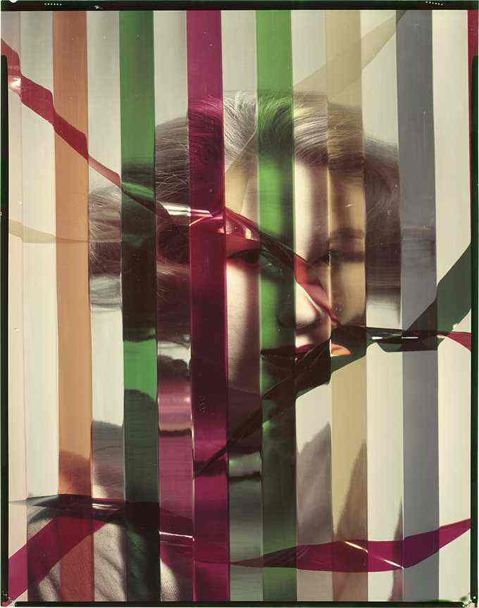
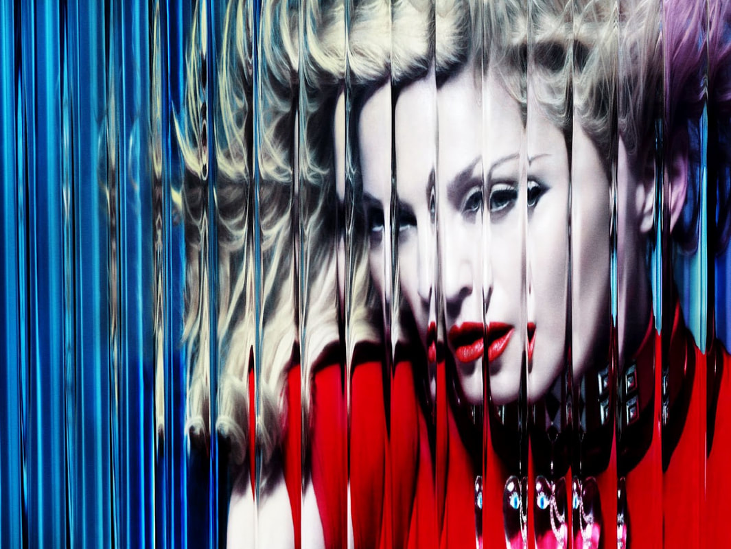
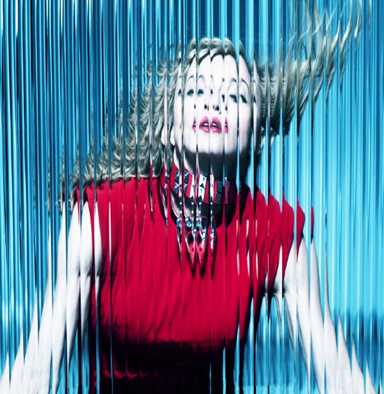
Erwin blumenfeld
Erwin Blumenfeld was born in Berlin in 1897 and took influences for his photography from the Dadaists and uses techniques like solarisation, multiple exposures, and photomontage into his images.
|
|
|
|
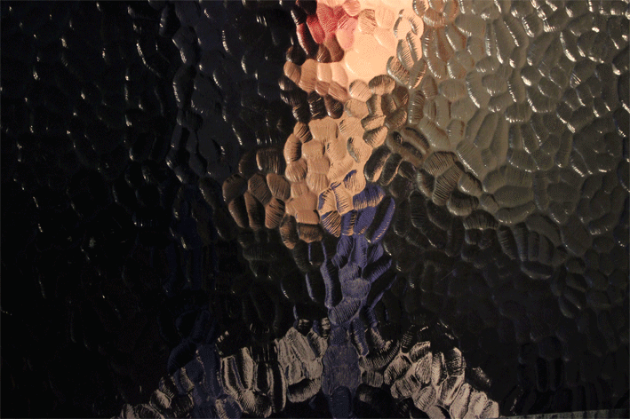
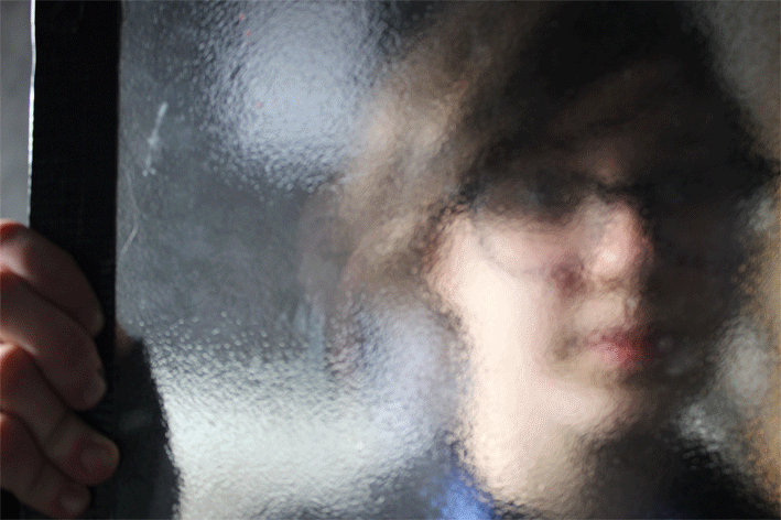
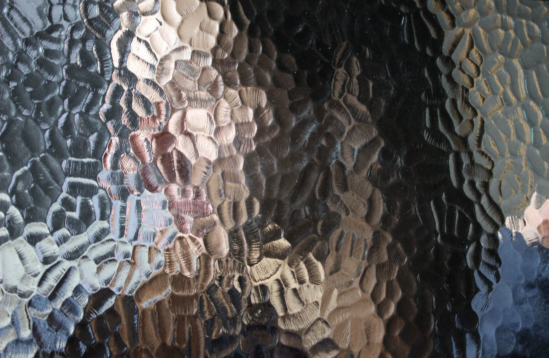
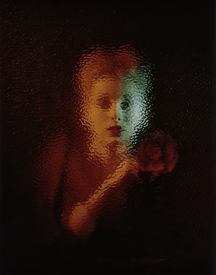
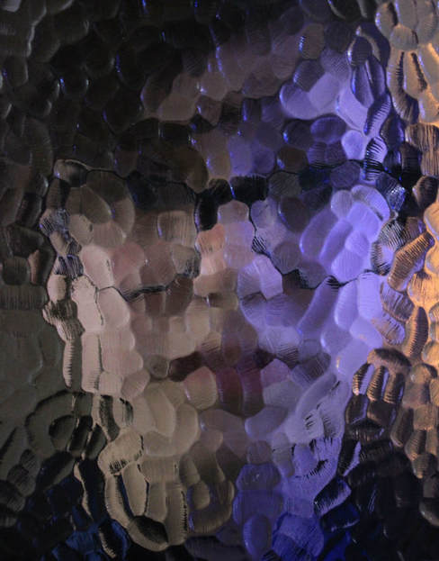
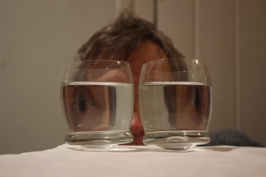
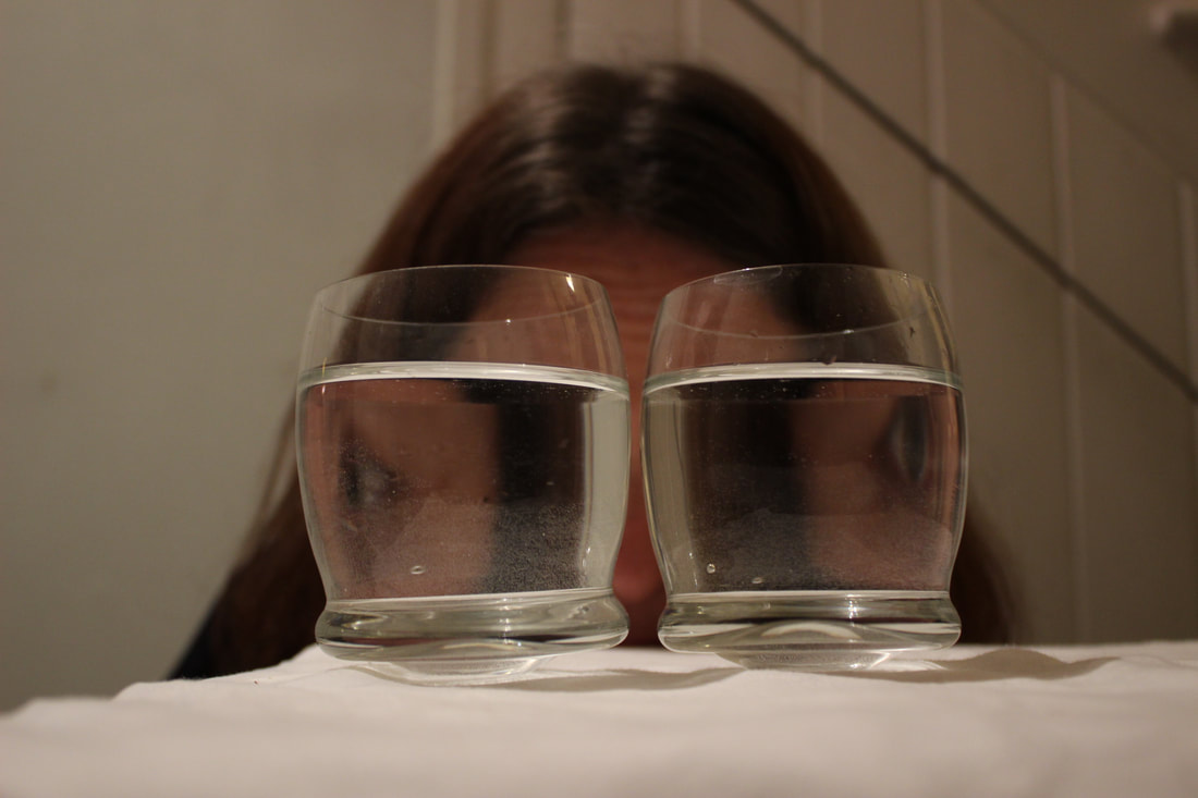
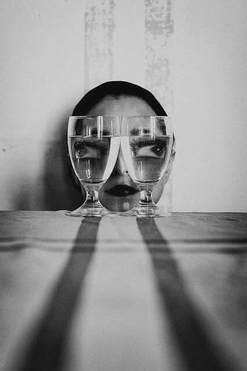
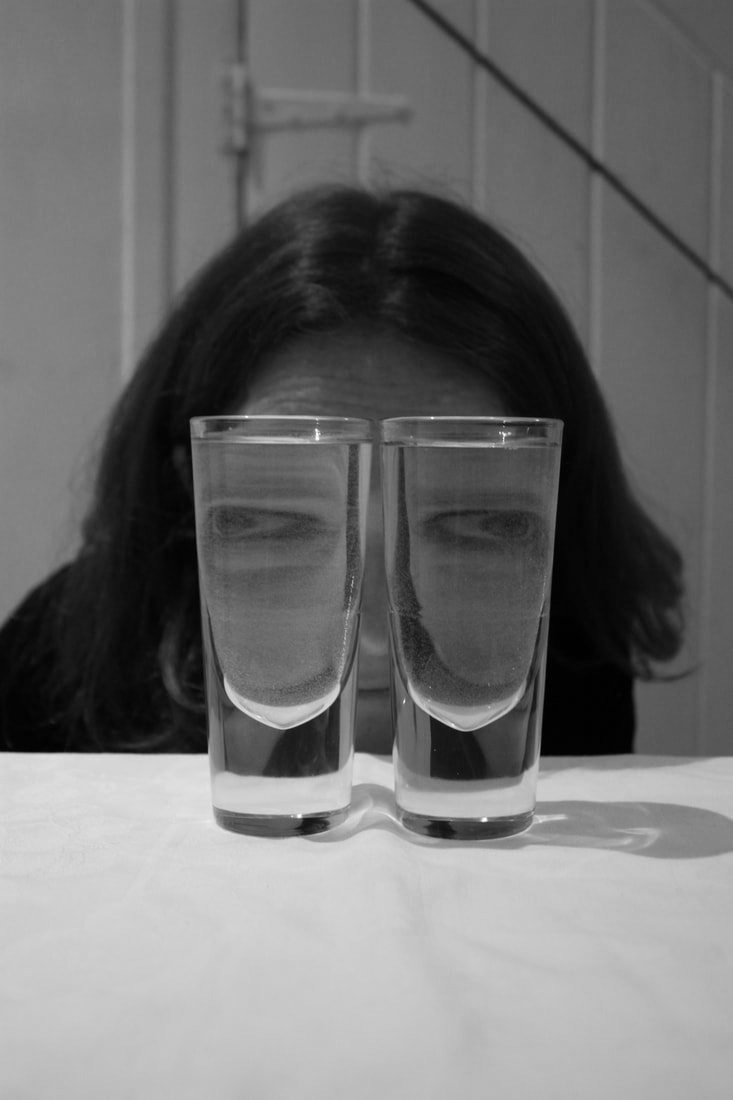
Fragmented Portraits:
In this I wanted to create fragmented portraits through patterned glass. I wanted to try different types of glass and different colours behind the glass to create an interesting effect of the fragmented of face behind the glass. I also wanted to try and distort the faces so you can't see them completely, just the outline. This makes the images more mysterious to look at as you can't see there full face allowing us to interpret in in any way.


|

|

|

|

|

|

|
|

WWW:
I think the different types of glass and different colours create a contrast between the photos but also make the images more interesting to look at as each one is very different from the others. I achieved what I wanted having the faces slightly distorted making the photos quite mysterious and intriguing. The images also fit the theme fragments very well as the faces are fragmented through the glass. In the last one the glasses help very well to add an extra element but also to frame the face so we can see it well even though the image is dark.
EBI:
I could have tried to see how the images turned out if I had the person closer or further away from the glass to see them more clearly or more distorted and figured out what they would have looked like to vary my images more. It would have also worked well if they had lipstick on or some other colours that would have shown clearly through the glass to add another element to the image because it works really well in Erwin Blumenfelds work and I would have liked t see how this adapted the image.
Artist and Me:

|

|
Three strands:
Kaylynn Devney
Kaylynn Deveny was born in Alburquerque, New Mexico. Kaylynn Denvey earned a masters degree in documentary photography in 2001 and went on to do a Ph.D in photography both in the university of Wales. Deveny's work has been exhibited internationally. This project is called 'The day to day life of Albert Hasting' which is a photographic diary of Albert Hasting's life. I think that this is interesting because it very personal and for a person who didn't know it gives us snippets of his life and intrigues us of what he likes doing and what he does in his day to day life.
|
|

|
Fragments of person:
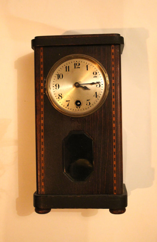
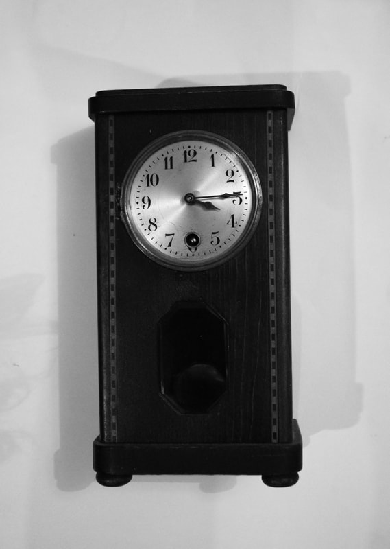
In my last set task of fragments of a person, I pictured what my grandad likes, so in this development I wanted to show what he likes doing in his house and when he goes out so I went I pictured him going out for a walk to the supermarket, also making mash potato which he is best at, editing his photos from his travels and winding his clock made by his great, great, great, great grandfather. I wanted to get deeper into his life than my last response like Kaylynn Deveny did in her work.
WWW:
I think that I pictured what he likes doing well and developed it well from my last response with more of what he like doing not just what he likes. This images are also interesting to see and you would know what he likes doing even if you didn't know him. These images also work well as a collection and as a photographic diary which I what it is supposed to reflect.
EBI:
I could have done a few more photos outside instead of mostly inside and some more in his garden because he loves gardening. I also could have tried to develop it further by writing what he is doing like kaylynn deveny did underneath the image to make it seem more like a diary of his life and make it feel more personal. I also could have thought more carefully about the order I put them in which would be the most interesting.
Artist and Me:
|

|
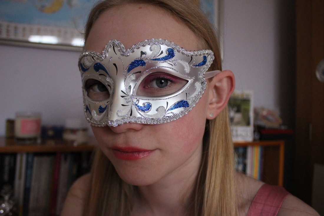
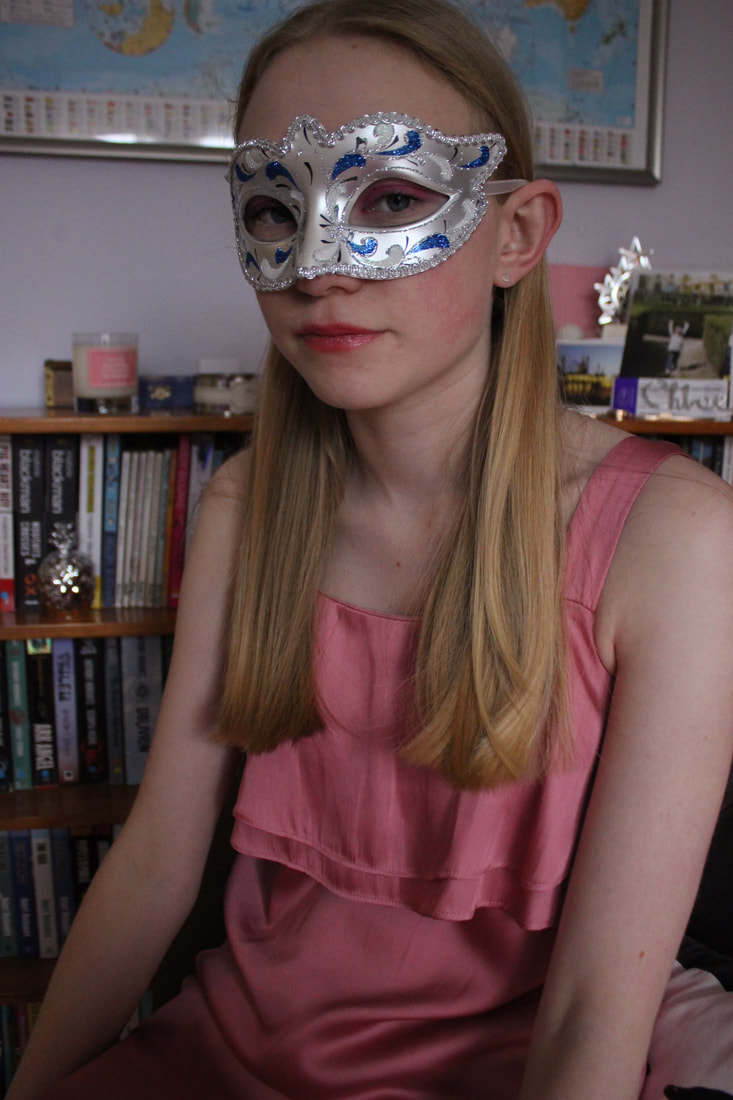
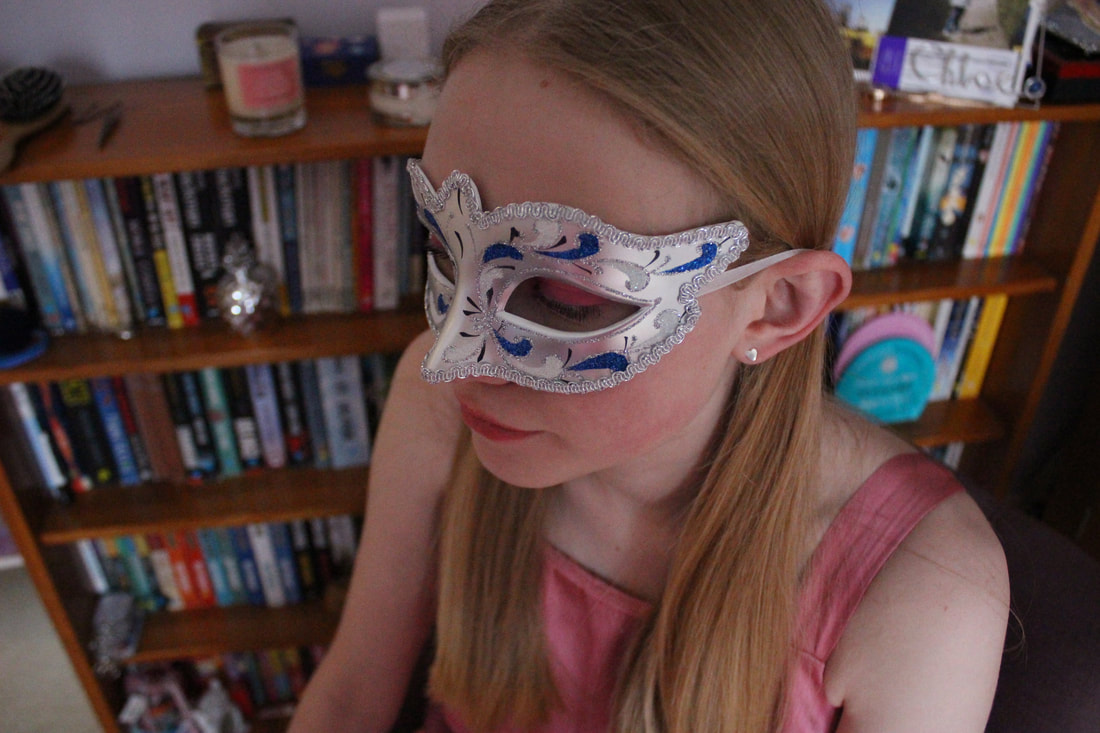
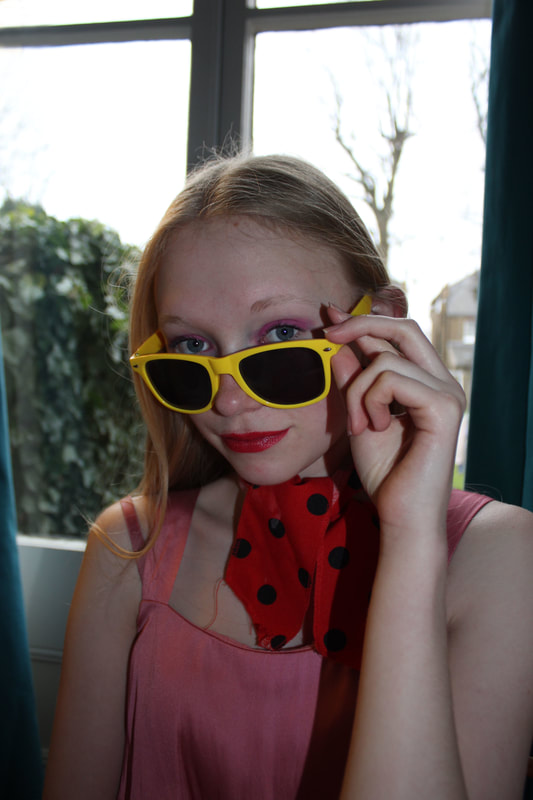
Cindy Sherman
Cindy Sherman is an American photographer and film director and she is best known for her conceptual portraits. In these images she dresses herself in different disguises and takes headshots of these different disguises as if she is different people in each one. I think these images are very intriguing for they are very different for what I have seen before. I also really like I idea of different personalities in the same person.


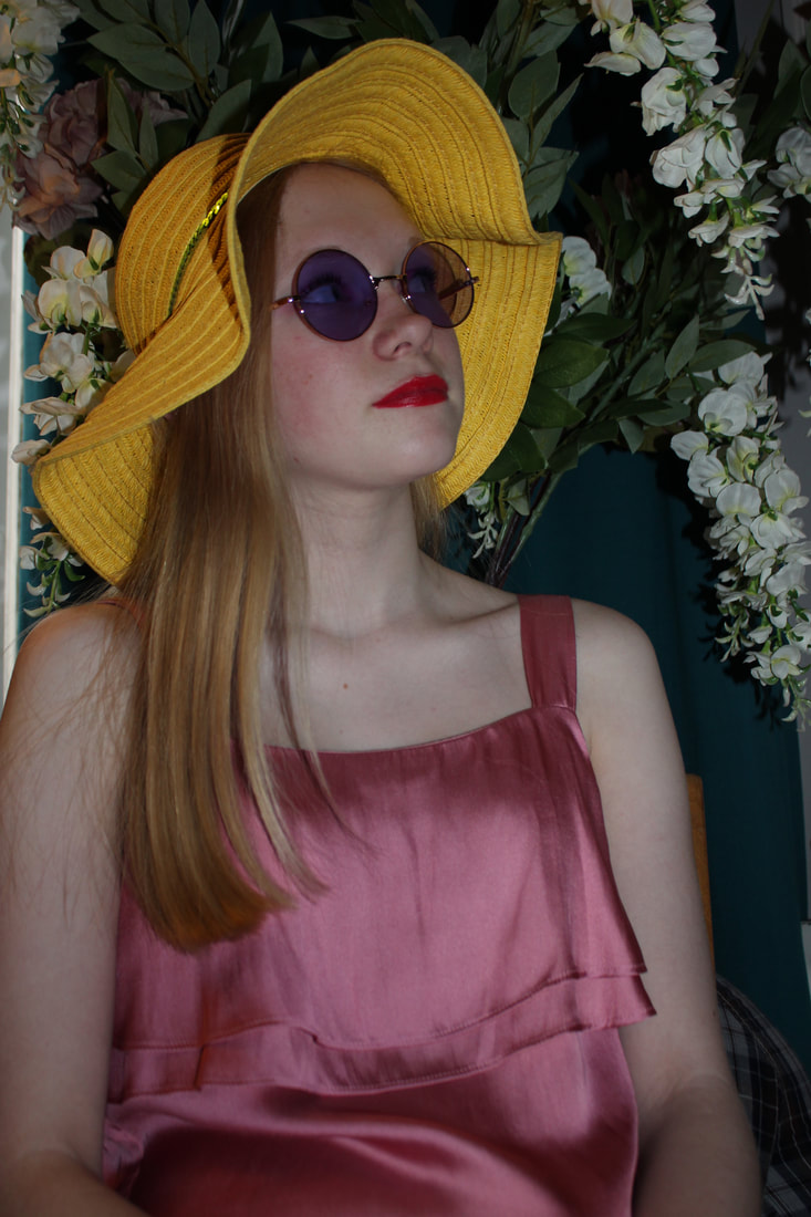
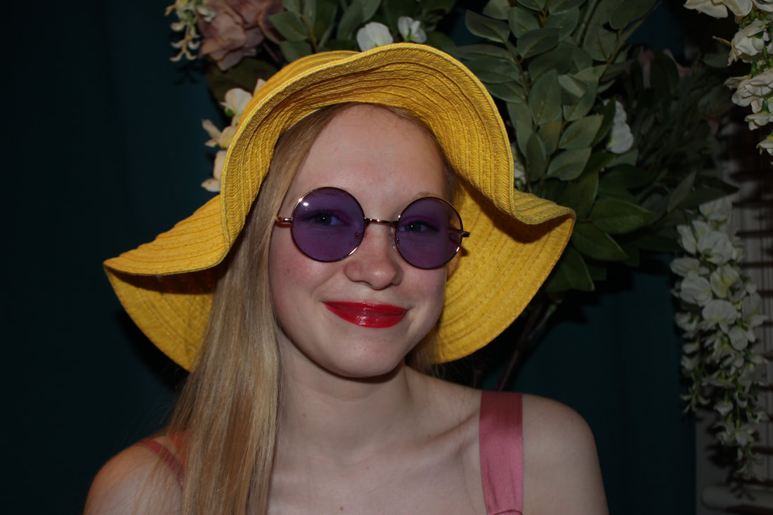
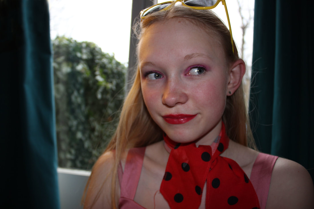
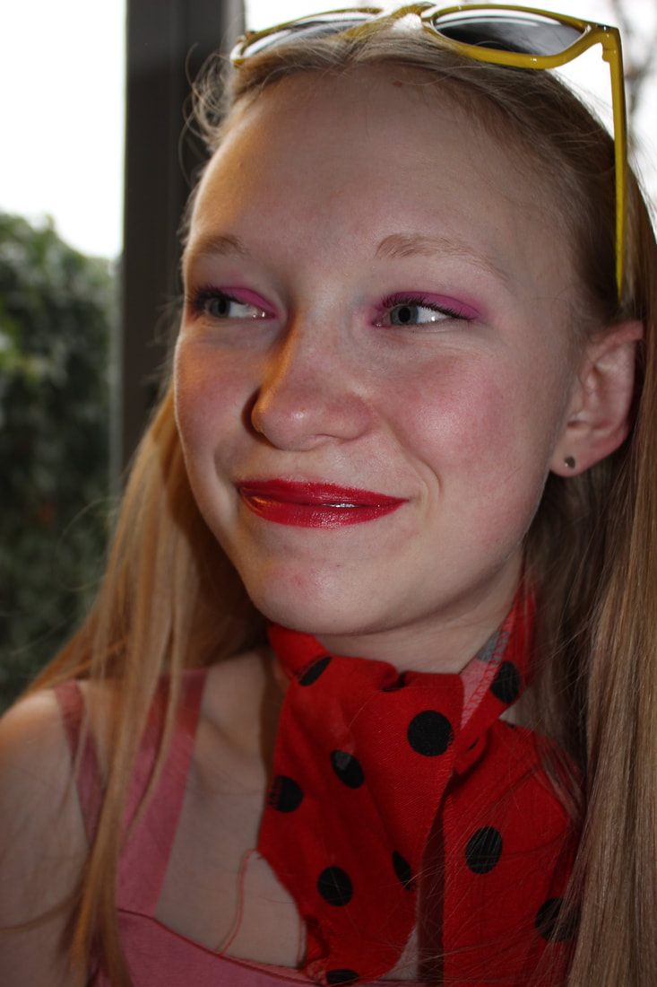
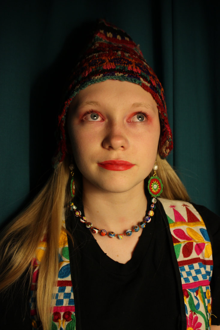
Portrait disguises:
I chose this stand because I was really interested in the idea of the same person in disguises as if fragments of themselves. As if each disguise reflects a different personality and a different side to the same person. In this strand I wanted to try and do different central colours for each disguise and different backgrounds in each to clearly portray the different disguises and contrast them from one another. This would allow the person looking at the to clearly see the different sides to the same person.

|
|

|
|
|
|
|
|
|
|
|
|
|
|
|
|
|
WWW:
I used the same model each time which is effective beause it shows the different sides and personalities to one person. The disguises are also all very different from each other and all have different backgrounds which works well. There is also a clear central colour in each disguise which clearly defines and separates each disguise. I was also inspired by Cindy Sherman by doing close headshots of her which helps to concentrate just on the head and clearly see the face which is the part of the body that is most different and shows the personality of the person which is what I wanted to show.
EBI:
She could have done more poses in them that reflect the disguise to make them more realistic. I also could have tried some more interesting backgrounds to add to the disguises instead of just in my house. In Cindy Sherman's work she is also very extravagantly dressed in each disguise with make up and wigs which is very memorable and she is hardly recognisable from one disguise to the next so I could have tried more extravagant disguises to differ the disguises from one another more.
Artist and Me:

|
|
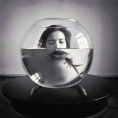
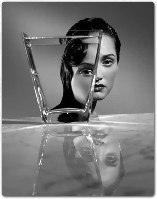
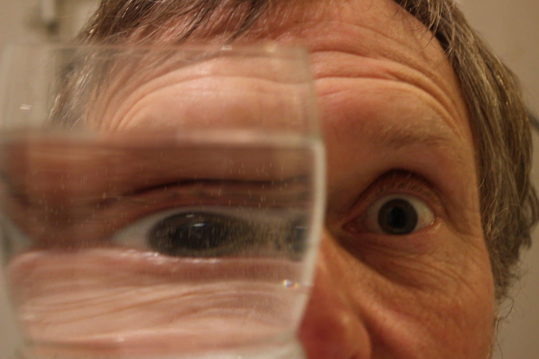
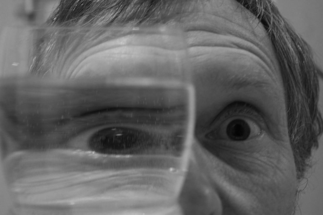
Antonio Gutierrez Pereira
Antonio Gutierra is a Spanish photographer. He is interested in portrait and fashion photography. Here he uses the refraction of water to distort people's faces behind water in a glass. He also uses perspective to get the exact part of the face in the water really well. I think that these are very interesting because he has got the perspective exactly right to get the exact part of the face manipulated.

|
|
|
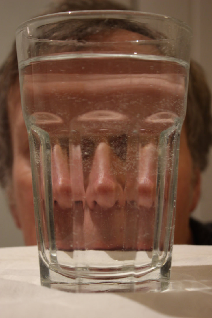
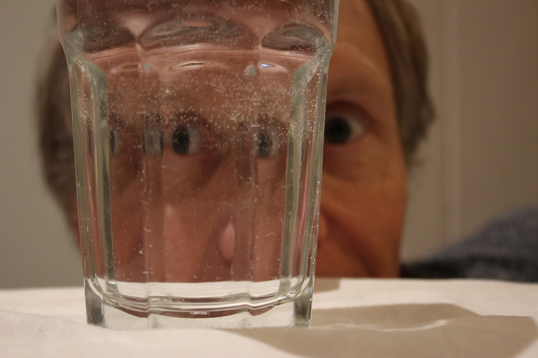
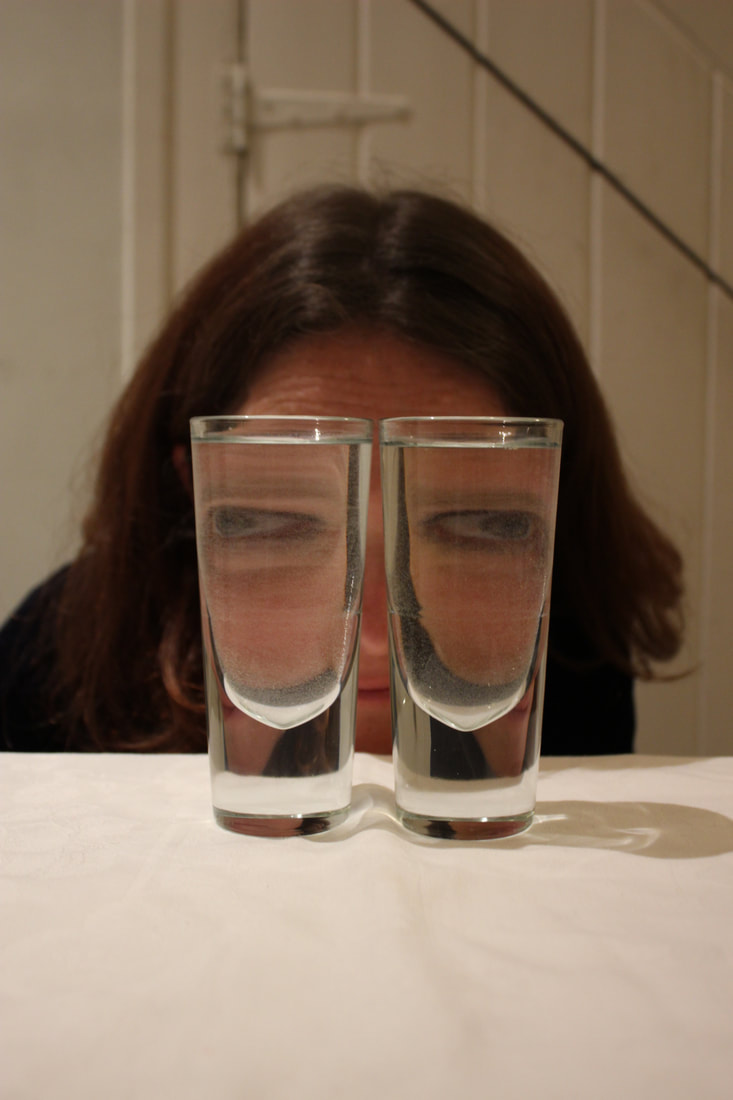
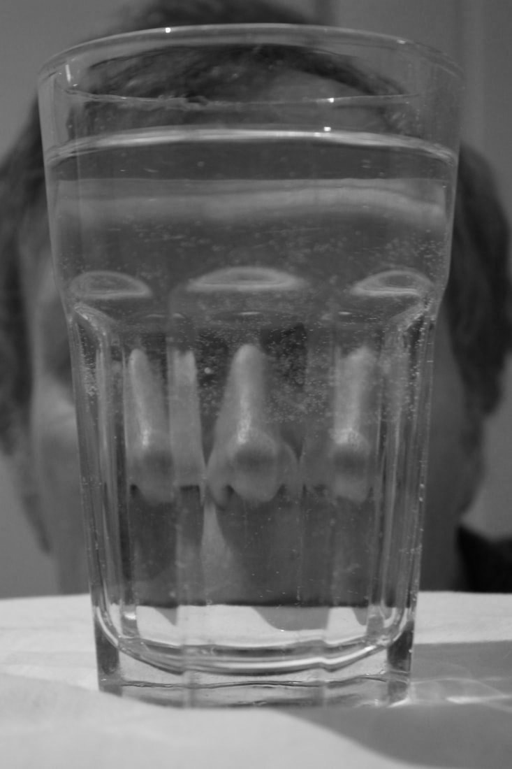
Distorted Faces:
I chose to do this strand because of looking at Antonio Gutierrez Pereira's interpretation of distorted portraits. I found these very interesting because they look very unnatural and twisted and seem unrealistic to look at so I wanted to try and see how I could twist and develop these portraits. In my response, I wanted to try and get the perspective exactly right to get the distorted parts of the face behind the glass well so that they seem natural but interesting to look at.
|
|

|
|
|
|
|
|
|
|
|
WWW:
The images are done well to get the natural look with multiple parts of the face of missing parts of the face which is exactly what I wanted to achieve. The way that the faces have refracted in these images is very interesting because everything looks twisted and strange, making them look unreal. I also developed this from Antonio Gutierrez's work but not just doing faces but also fragmenting the floor which is very interesting because the black and white works very well but you can also see the floor behind it as well as the fragmented part in the glass showing clearly the fragments in the image.
EBI:
I could have tried to go closer up into their faces to concentrate more on the distorted faces rather than the background or I could of cropped off the background. I also could have tried to get rid of the bubbles in the water to show the distorted faces more clearly. I also could have tried to use some other objects other than glasses or some differently shaped glasses to see how they distorted the person. I also could have seen what the images looked like black and white and whether that worked.
Artist and Me:
|

|
Black and White Edits:
RESPONSE TO EBI'S:
|
|
|
WWW:
This allows me to compare my other edits to these which is good to see which one I prefer. I think that these black and white edits look better as they highlight the distortion of the faces more without the distraction of the colour but also help to make them a bit more creepy and mysterious which I like about these images.
EBI:
I could have gotten closer to the distorted faces and tried to do a few more different parts of the face that you wouldn't expect to be more of a surprise.
Strand Development:
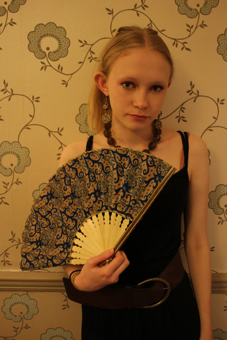
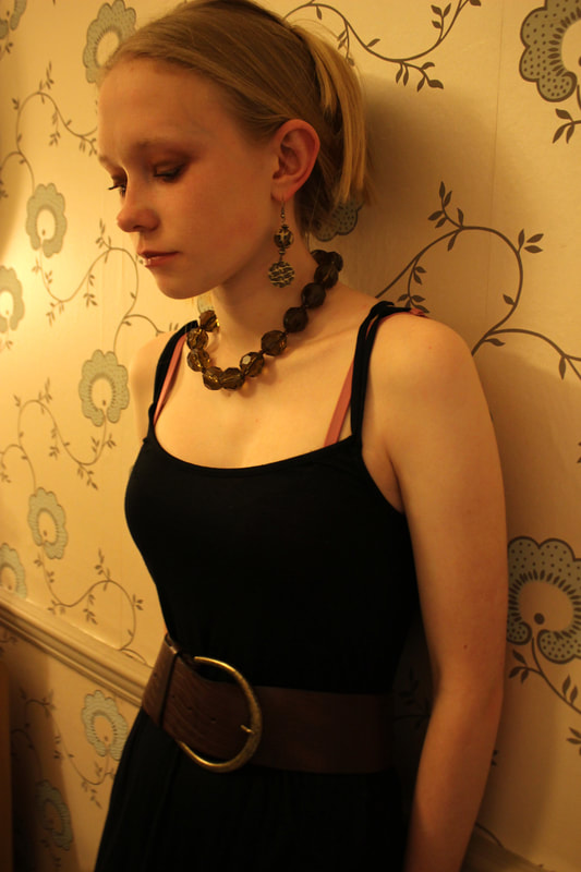
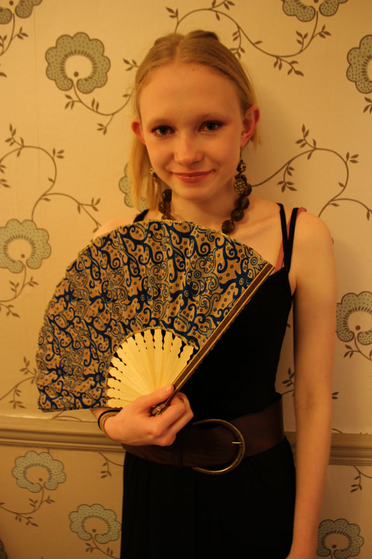
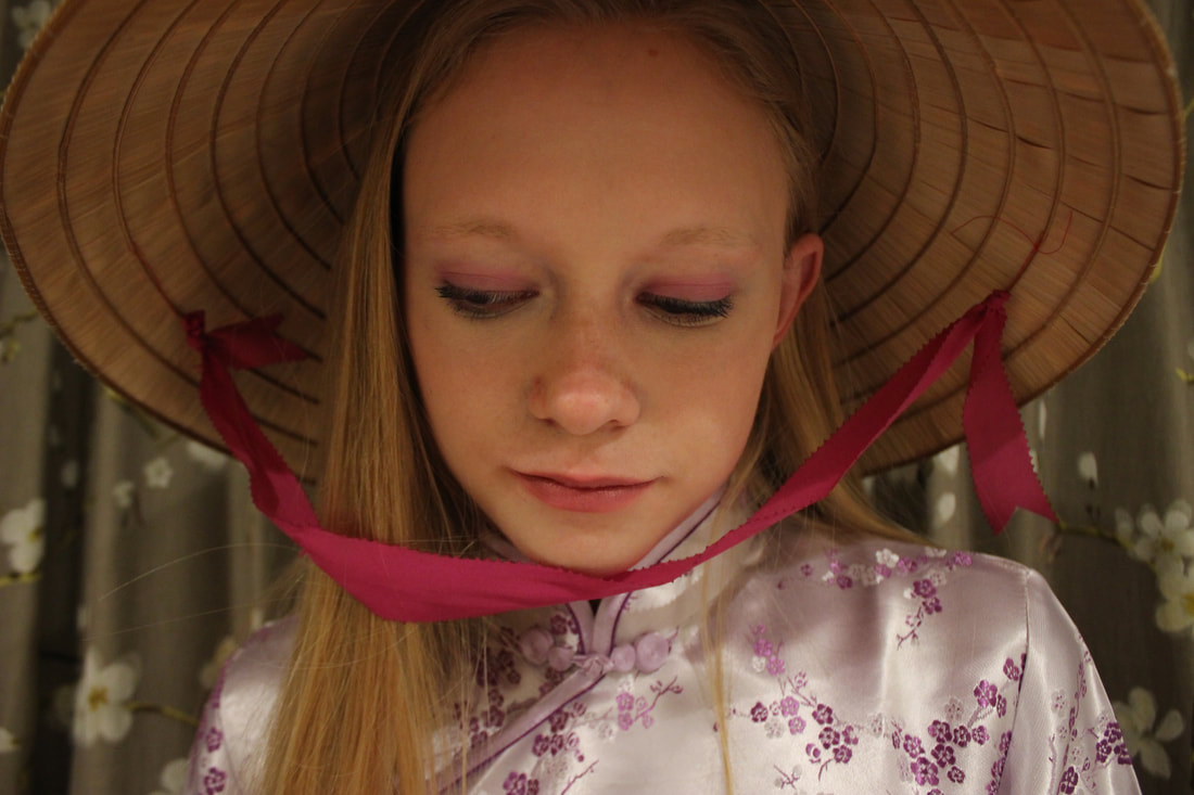
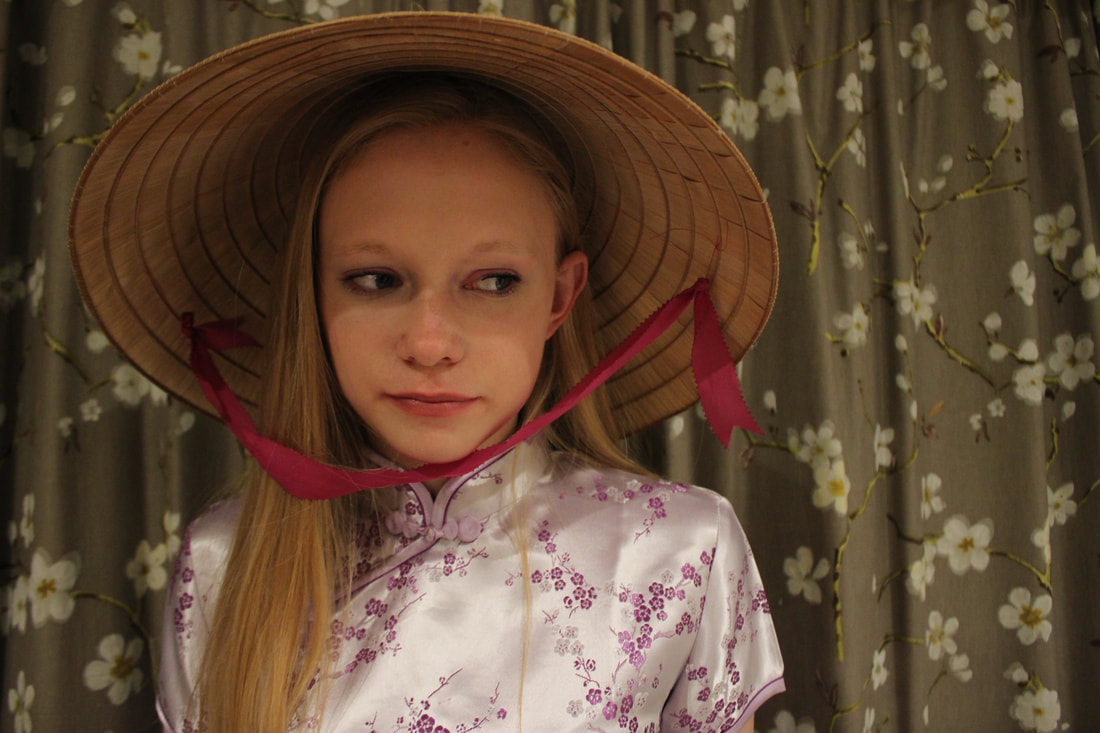
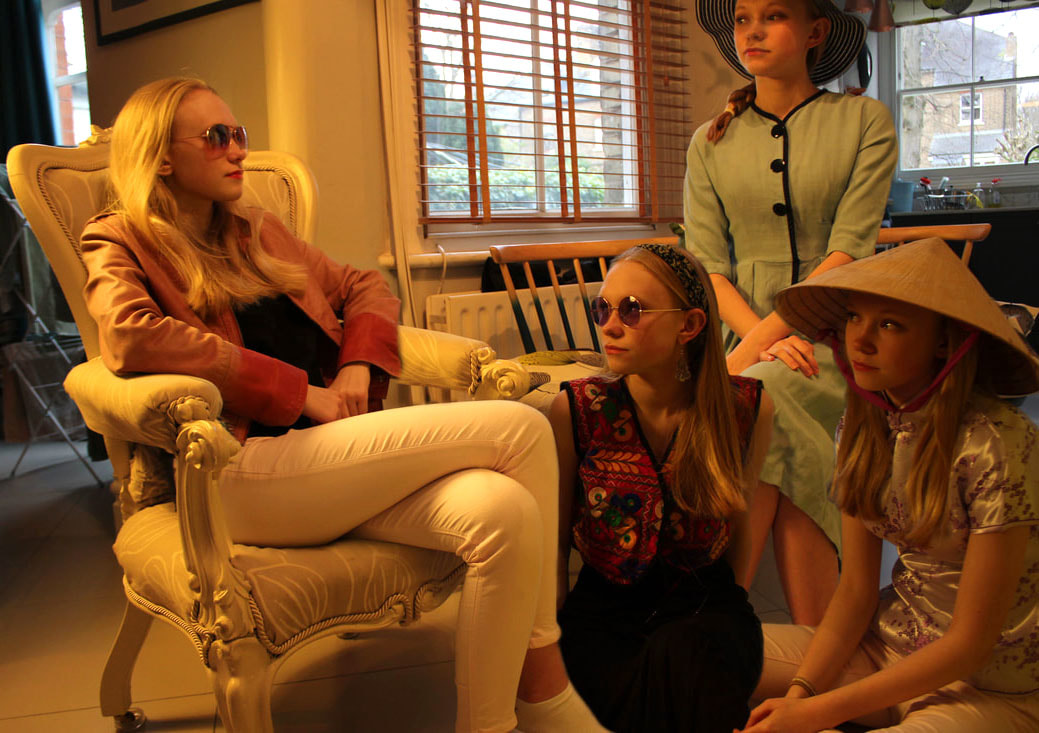
Fragmented personalities
I chose to develop this strand because I think it had the most freedom to develop but also I liked the idea of fragmented personalities. I wanted to try and take photos of different and more interesting disguises than my strand to contrast the disguises and the moods they present in the images. I also wanted to try and do more interesting backgrounds in the images than my last response.
|
|
|
|
|
|
|
|
|

|
|
|
|
|
|
|
|
|

|
|
|
|
|
|
|
|
|
|
|
|
|
WWW:
I think that this development is better than my last attempt because I tried to do some more original backgrounds that fit with the theme of the costume. I also tried to do some more original makeup for each one to define each costume more and make each one look different to one another. I also used more props this time which I think makes the images look more realistic and adds another interesting element. There also a set colour in each one which I wanted to achieve because it makes the image stand out more.
EBI:
I did mainly close up portraits so I could have tried to do some more full body photos. I also could have tried to vary her hairstyles more to make her look like a different person in each disguise. I also could have tried some more extravagant makeup to catch your eye with brighter colours like Cindy Sherman's work.
Artist and Me

|

|
Paul Smith
Paul smith is a British photographer who photographs himself in different disguises and layers them onto one photo. This is interesting as it tells a narrative with each of the disguises doing a different thing with different emotions. Also, at first, you don't realise that all the people are him and it comes as a surprise when you realise this. I think this is very cleverly done and I was intrigued to try and do it myself.


2nd Strand Development:
Fragments of a personality
I chose to develop this strand even further as I wanted to not only do headshots but put all the different disguises into one image. I wanted to this because I saw Paul smith's work and thought that it would very interesting to use that idea of the same person appearing multiple times in an image but in different disguises. This would portray my theme better as you can see the same persons different personalities all together in one image making it clearer than in headshots.
PRINT SCREEN PROCESS:
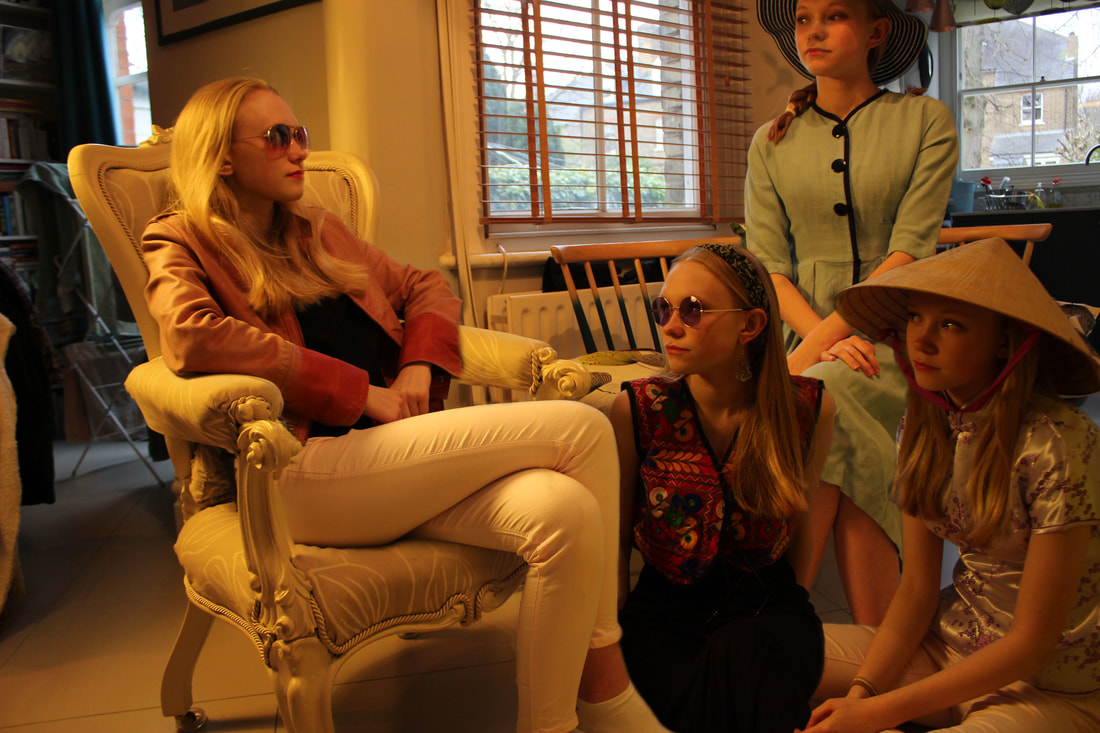
WWW:
The disguises are all very different and interesting but also are interacting which makes it seem more natural and realistic. The props work well to enhance the disguises and make them more different from one another. They are also photoshopped well so they seem like all of them are actually there with each other.
EBI:
They are all quite cramped into the image so in my next development I think they should be more spaced out to be able to appreciate the disguises more. The image is also quite dark and yellow so could be lightened up and increased the contrast to be able to see the disguises more clearly and make it more clear that she is the same person in all the disguises.I also could have cropped the image or moved some of the things in the background so it doesn't distract you from the disguises.
RESPONSE TO EBI:
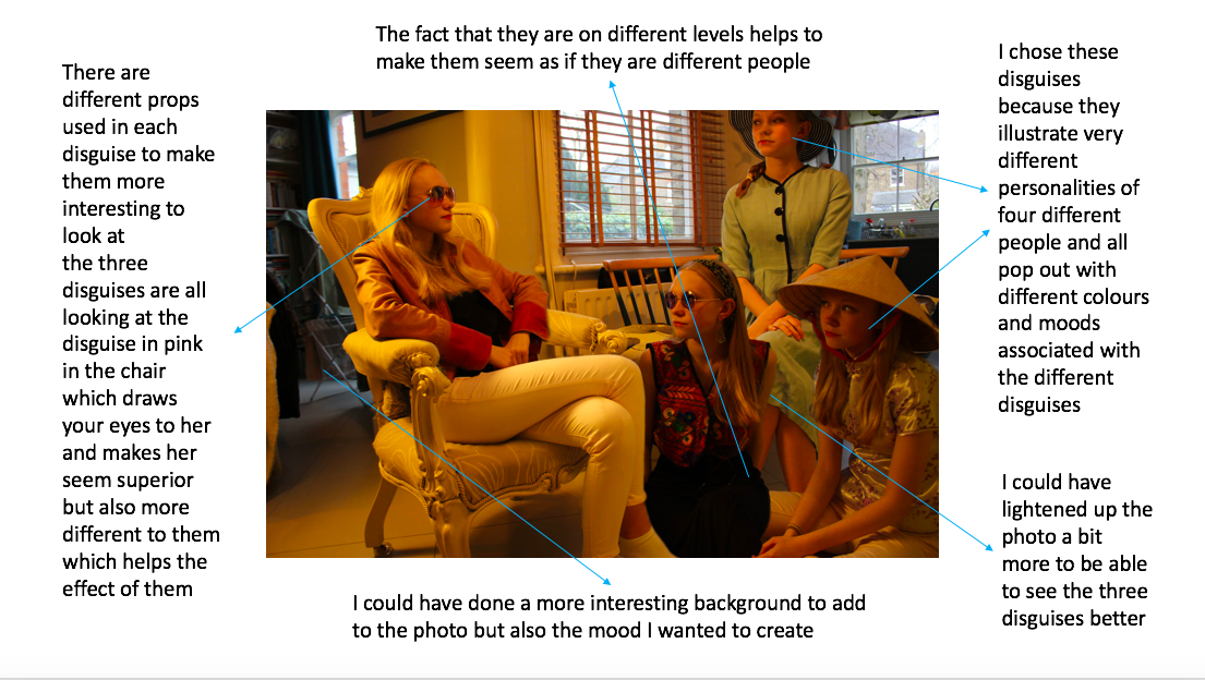
Final Pieces:
I chose to do this idea of fragments of a personality for my final piece because I find this idea very interesting that people can have different sides to the same person. I wanted to explore this further than my developments of head shots and have all these fragments in the same image to contrast the personalities by allowing you to see them all together. I wanted to photoshop them well to synchronise them into one image and show them interacting and all doing different things. In this response I also wanted to develop it from my last response by doing different backgrounds to make the image more interesting but also to give me more freedom of what each disguise is doing in the image.
WWW:
I think that these are very effective with lots of improvement from my last development. The background is interesting in each one and works well with the disguises. The disguises are spaced well so that you can see each disguise clearly. I also thing that the props are used well in each disguise to change the mood in each disguise to differ from each other. I also did a variety of environments, outside and inside, which makes them as a collection work well together. It also makes them more interesting as each image is very different from each other.
EBI:
I could have tried out some more extravagant disguises and also done them closer up to be able to see the disguises better. I also could have tried doing different times of day with different weathers to see how they worked with the background and the disguises. Also I could have tried some different hairstyles which would have helped to differ the disguises even more.
